
We Meat Again
We Meat Again is a fun new burger joint that needed a mobile app that reflected it’s quirky & retro aesthetic to stand out from the competition, while also being super user friendly for placing & customizing orders online.

Introduction
We Meat Again isn’t your average burger joint—and this wasn’t your average app project.
Set in the world of cheeky nostalgia, neon diner signs, and unapologetically juicy burgers, We Meat Again is a brand that prides itself on blending retro charm with modern-day flavor. The restaurant already had a strong in-person presence, drawing in customers with its playful name, vibrant personality, and unforgettable food. But it was missing one thing: a mobile experience that lived up to the hype.
This project set out to change that. The goal was to design a custom mobile app that not only made ordering burgers fast and convenient, but also brought the brand’s quirky, retro personality to life in digital form. More than just a place to place an order, the app needed to feel like an extension of the restaurant itself—fun, inviting, and just a little over-the-top in the best way.
The challenge was to translate the physical brand experience into a seamless, joyful mobile interaction—balancing visual storytelling with practical usability. That meant everything from choosing fonts and icons that echoed vintage diner menus, to crafting juicy product imagery that would make users' mouths water from the first tap. It also meant understanding the needs of real users—whether they were loyal regulars looking to reorder their usual or first-timers just curious about the hype.
Over the course of this project, I conducted user research, explored competitor apps, mapped out user flows, built a brand-specific design system, and prototyped and tested a complete mobile experience. Every decision—from color palette to menu layout—was made with one thing in mind: making sure that We Meat Again wasn’t just another burger app, but a craveable, scroll-stopping experience from start to finish.
Project Summary:
I wanted to design a mobile ordering app for We Meat Again, a quirky, retro-style burger joint known for its juicy patties, fun brand voice, & nostalgic diner flair. The goal: create a seamless, crave-worthy digital experience that reflects the brand’s personality & makes ordering fast, easy, & memorable.
Role:
UX/UI Designer, User Researcher, Visual Designer
Tools Used:
Figma & Canva
Let’s Get Down To It
As We Meat Again continued to build a loyal following with its quirky branding and crave-worthy burgers, one major gap in the customer experience became clear: there was no dedicated digital space that matched the restaurant’s unique flavor—literally or figuratively.
Customers loved the food and atmosphere in person, but when it came to online ordering, they were stuck using clunky third-party platforms that felt generic, impersonal, and completely disconnected from the brand. These platforms not only limited customization and upselling opportunities but also stripped away the fun, personality-driven experience that made We Meat Again so memorable.
For newer customers discovering the restaurant for the first time, there was no digital journey that captured the vibe or encouraged exploration of the full menu. And for returning fans, the lack of a streamlined ordering process—especially one with options to customize, save favorites, or track rewards—led to friction and frustration.
The brand needed more than just a mobile ordering solution—it needed a full digital extension of its identity. One that could:
Offer an easy, intuitive ordering process for all types of users
Reflect the playful, retro personality that sets We Meat Again apart
Highlight popular items and promotions in a way that felt curated and craveable
Build loyalty through delightfully branded touchpoints and user-centric features
This project set out to solve those issues by designing a mobile app that didn't just take orders—but told a story, invited engagement, and made every interaction feel like a happy reunion.
Goals & Objectives
Reflect the brand’s retro, playful identity throughout the app
Create a simple, user-friendly ordering flow
Highlight bestsellers and combos visually
Include features like customization, loyalty perks, and a “favorites” page
Ensure accessibility and responsiveness across devices
Defining the Problem
Methodologies Used:
Primary Data Collection: 1:1 User Interviews
Secondary Data Collection: SWOT Analyses
Data Synthesis:
Affinity Mapping
Problem Statements
User Personas
User Flows
User Interviews
To better understand how people interact with food apps—and what makes them love or leave a digital dining experience—I conducted remote user interviews with a diverse group of participants. These conversations helped me dig deeper into real behaviors, beyond just surface-level preferences.
The interviews were centered around three key questions:
What influences customer satisfaction when navigating restaurant websites or apps?
What drives someone to choose specific menu items over others?
How much does a restaurant’s aesthetic or visual brand impact their decision to eat there?
From there, I used follow-up questions to uncover user habits, frustrations, and motivations—from the annoyance of clunky menus to the surprising importance of vibey branding. These insights played a major role in shaping everything from layout to imagery, making sure the app didn’t just work, but actually resonated with users emotionally. Because in the burger world, taste matters—but so does the experience.
SWOT Analyses
Before diving into design, I conducted SWOT analyses to understand We Meat Again's position in the market and identify opportunities for digital growth. By looking at competitor restaurant’s strengths—like bold branding, loyal customer base, and standout menus—I was able to highlight what needed to shine in MY app experience. At the same time, I considered challenges that other restaurants faced such as the lack of existing digital infrastructure and rising competition in the food delivery space. This process helped me zoom out and strategically guide the direction of the app, ensuring it wasn't just functional—but a competitive advantage.

Affinity Mapping

To make sense of user interviews and survey data, I used affinity mapping to group recurring thoughts, pain points, and desires. This visual clustering helped me uncover major themes in user behavior—like the importance of quick customization, the desire for visual menus, and the craving for personality in food apps. Seeing these insights organized by user mindset made it easier to define feature priorities and pinpoint where the app could go beyond expectations. It also made sure I wasn’t designing based on assumptions, but on real patterns grounded in user voices.

Problem Statements
After conducting user interviews and organizing the data through affinity mapping, I uncovered several recurring frustrations and unmet needs among potential We Meat Again users. These insights became the foundation for four detailed problem statements—each one representing a different kind of customer with a specific pain point that the app could address.
Rather than making broad assumptions, I leaned into empathy-driven design by focusing on real-world scenarios. Whether it was a food influencer struggling to find content-worthy restaurants, a picky eater searching for more control over her meals, a decision-fatigued professional wanting a quick dinner solution, or a vegetarian looking for a place both she and her meat-loving partner could enjoy—each statement helped guide the features, flows, and overall app experience.
By rooting the app’s design in these human-centered narratives, I was able to ensure that We Meat Again didn’t just look good—it solved problems in meaningful, personal ways.
As a foodie social media influencer, I try to find interesting & unique restaurants to try out & post about, but the options I am presented with are either overdone & posted about too much already by others, OR they have no social media presence at all. This makes me feel discouraged & nervous that I am going to lose followers.
As a self proclaimed “picky eater”, I tend to be very particular about the restaurants I go to & the foods I try because there aren’t a lot of places that will let me completely customize my order to be exactly the way that I like it. This frustrates me & makes me feel like I’ll be stuck eating at the same 2 restaurants forever.
As a gal that has to make too many decisions at work all day, I want to be able to make a fast & easy decision when ordering food for dinner because by that point in the day, my brain is fried; but all the options that are available to me have 10 page long menus that go on forever. This makes me feel super overwhelmed & like throwing away the idea of ordering food away all together in favor of a peanut butter & jelly sandwich at home instead.
As an environmentally conscious vegetarian with a carnivore partner, I try to find restaurants that source their food locally & have dietary accommodations for both of us, but most of the places that we are interested in trying either ONLY have options for him or ONLY have options for me. This makes me feel super discouraged that we will never find the right spot for date night that we can both enjoy.
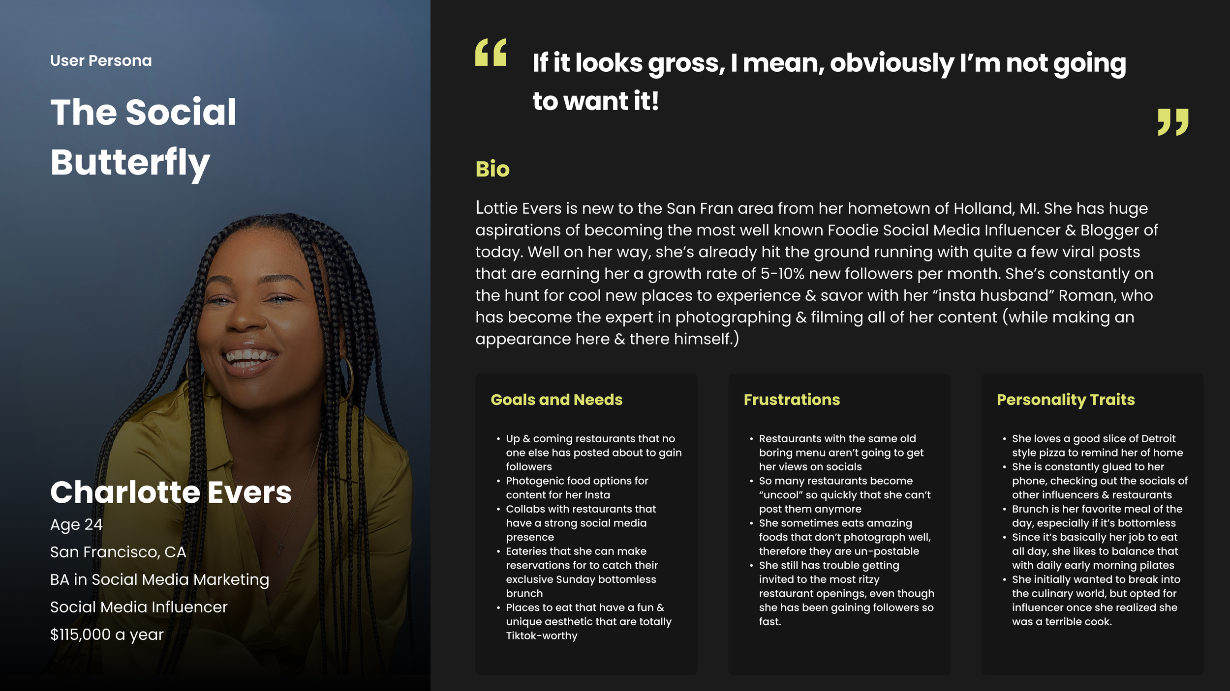
User Personas
Based on insights gathered from my user interviews, I created two distinct personas that represented the primary needs and motivations of my target audience. These personas helped guide both functional and visual design decisions throughout the project.
The first persona, Tabitha, is a self-described picky eater who finds most food apps limiting when it comes to customization. For her, control is everything—she wants the freedom to build her perfect burger without being boxed in by default toppings or vague options. Designing with Tabitha in mind pushed me to make customization a core feature, not an afterthought.
The second persona, Lottie, is an ambitious social media foodie who's constantly on the lookout for visually striking meals and restaurant spaces that are "Instagram-worthy." Her choices are driven by aesthetics, presentation, and the potential for content creation. Designing for Lottie meant prioritizing visual storytelling—using vibrant food photography, playful language, and a stylish interface that could support her content-driven goals.
Together, these personas ensured the app was not only functional, but also shareable, customizable, and deeply in tune with what real customers are looking for—whether they're building their dream meal or their dream feed.

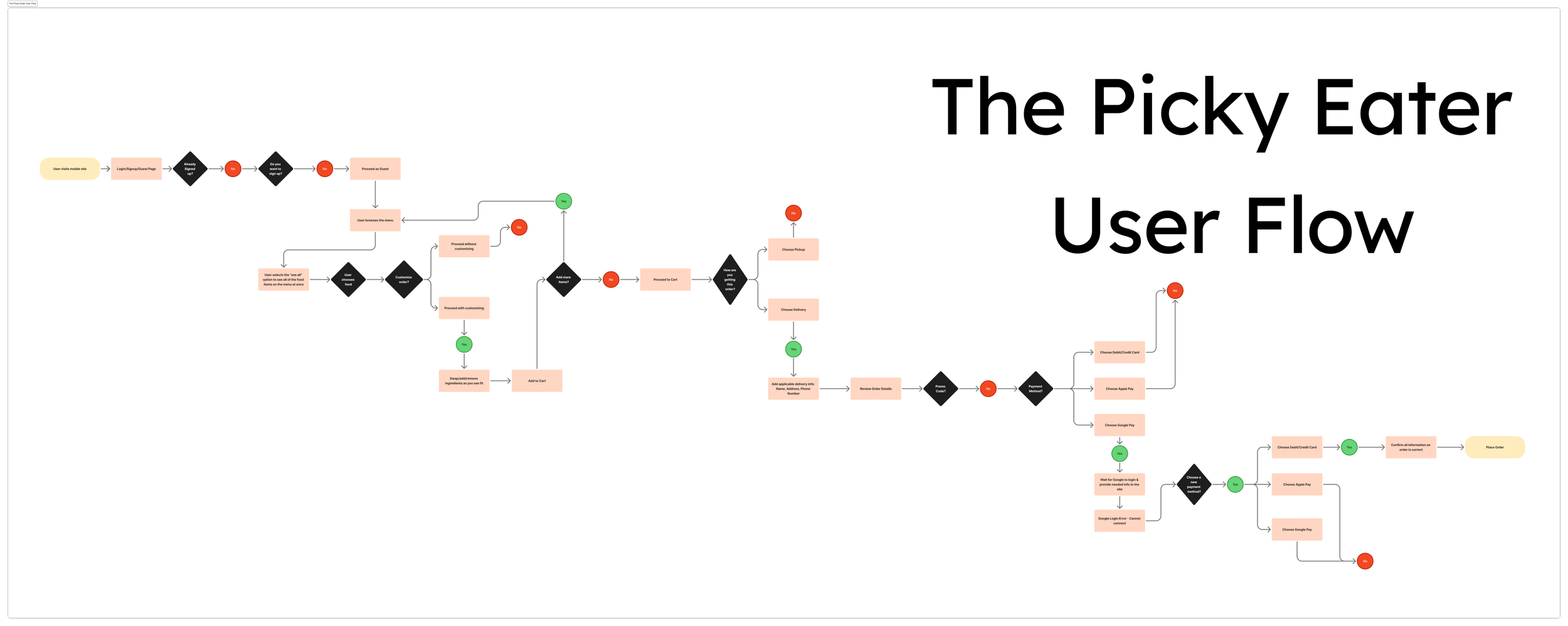
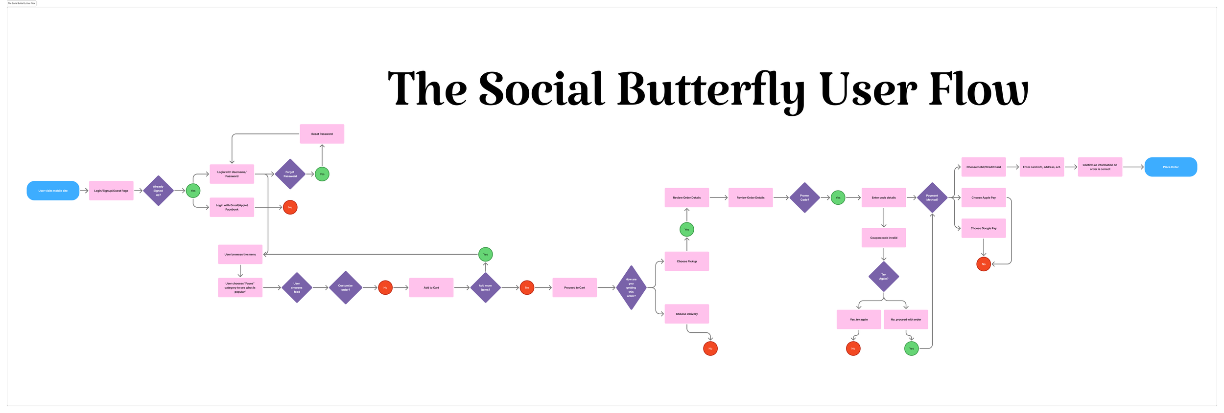
User Flows

With the structure locked in, I moved into mid-fidelity wireframes to refine spacing, functionality, and interaction patterns. This version added more clarity to the UI elements (like buttons, filters, and modals) and allowed for user testing focused on usability. It was a key step in making sure the experience felt smooth and logical, even before all of the final brand visuals were introduced.
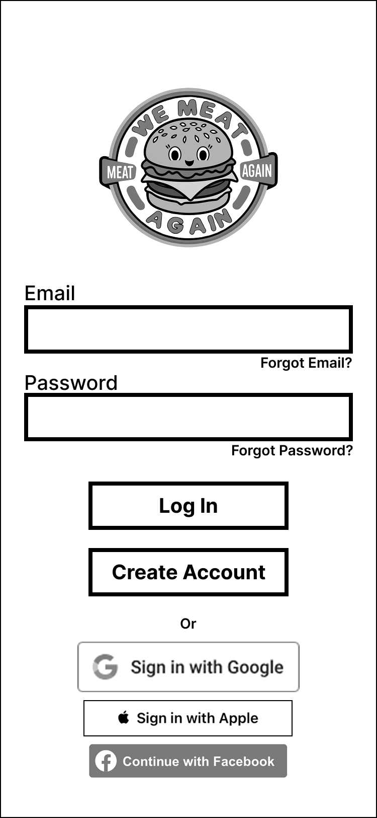
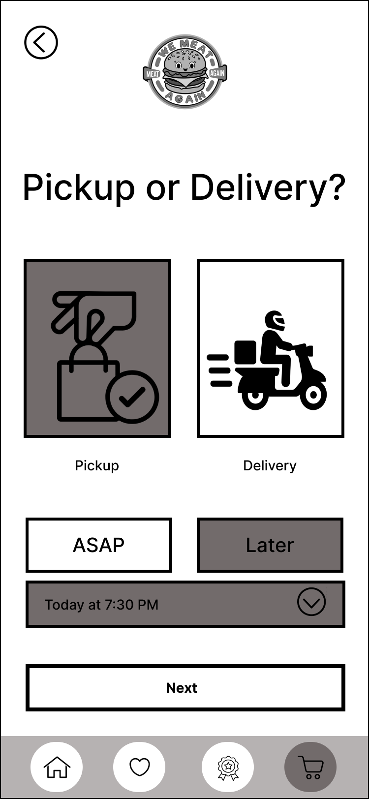
To ensure the app felt seamless from the first tap to the final bite, I mapped out key user flows for Tabitha and Charlotte, completing major tasks like logging in to the app, browsing the menu, customizing items, checking out, and using the pickup or delivery process. These flows helped me identify friction points early and focus on keeping the experience intuitive, especially on mobile. Each step in the journey was designed to feel clear, satisfying, and just a little fun—whether someone was building a custom burger or flying through a delivery order.
Designing the Solution
The visual design phase was where the personality of We Meat Again really started to sizzle. Building on the research and user insights, I translated the brand’s retro charm and bold voice into a playful, functional interface. Every screen was crafted to reflect the craveable, colorful energy of the restaurant—while keeping usability, accessibility, and hierarchy at the forefront. This stage focused on merging visual storytelling with practical UX decisions, ensuring that users didn’t just order food—they had fun doing it.
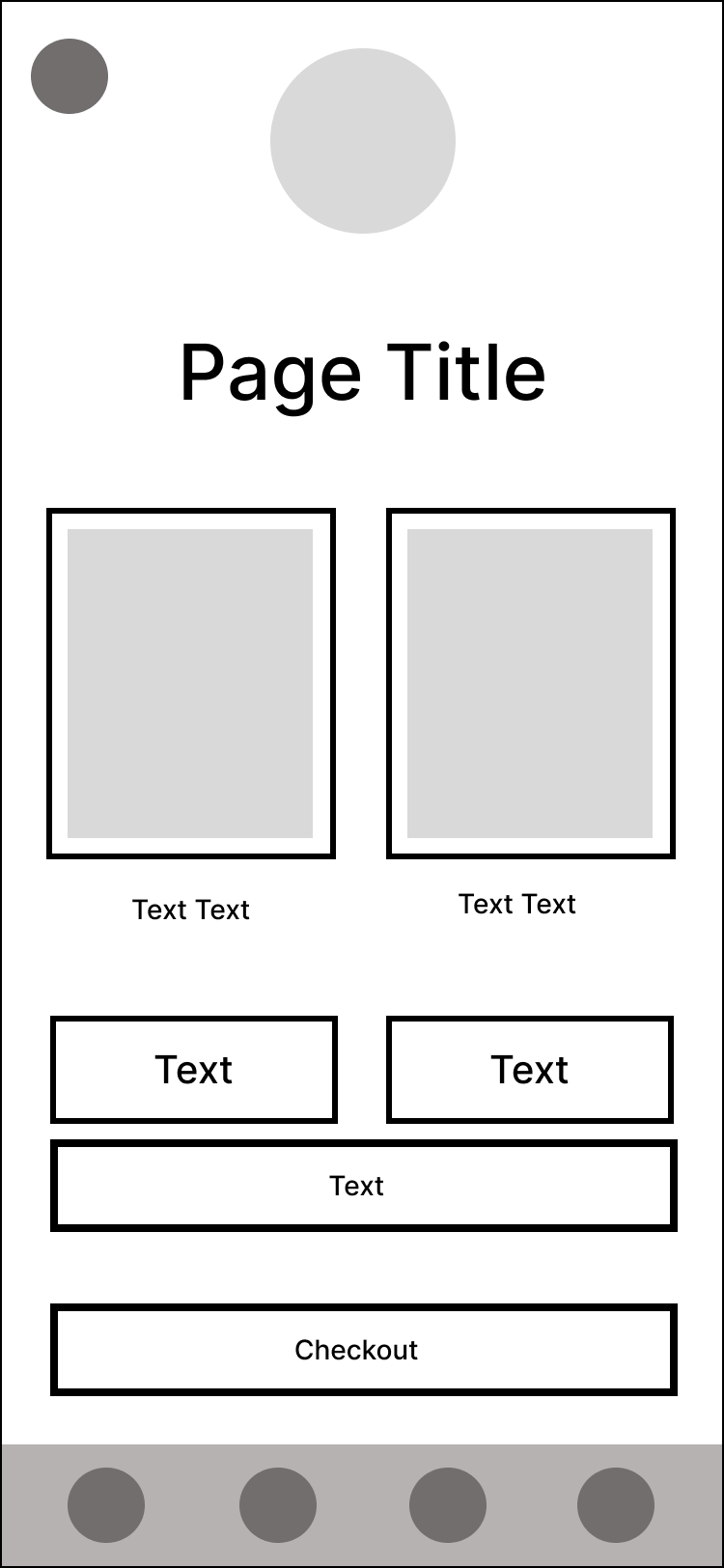
Lo-Fi Wireframes
I kicked things off with low-fidelity wireframes to establish structure and flow without the distraction of visual elements. This stage helped me focus on how users would move through the app—browsing the menu, accessing their favorites, checking out—all while keeping the layout intuitive and navigation straightforward. It was all about making sure the bones were strong before layering on the flavor.


Mid-Fi Wireframes


Prototype
Next Steps


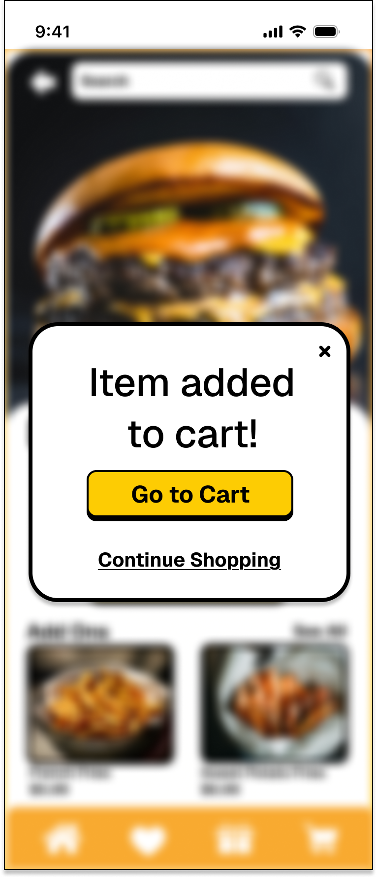
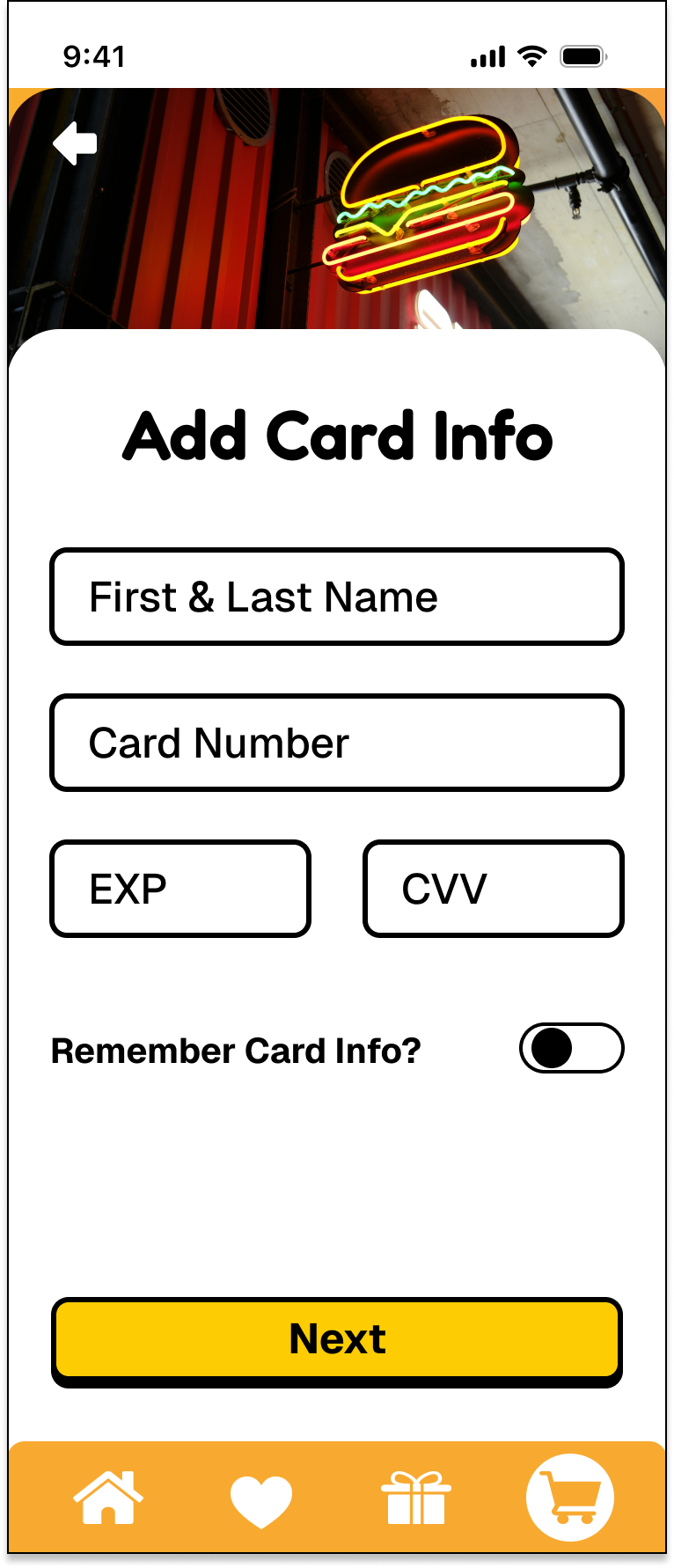
Hi-Fi Wireframes


Outcomes & Reflections
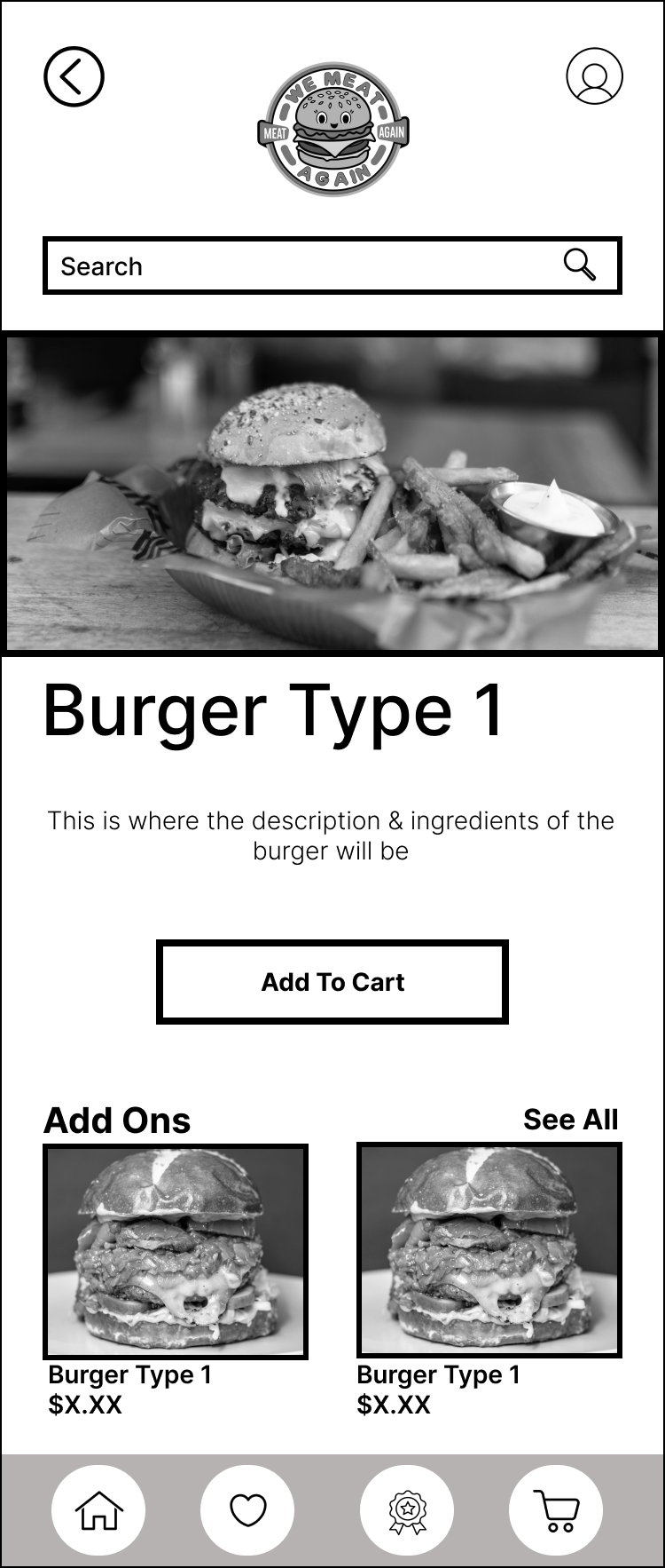
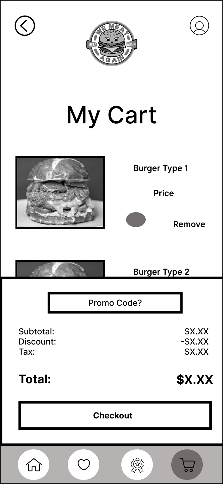
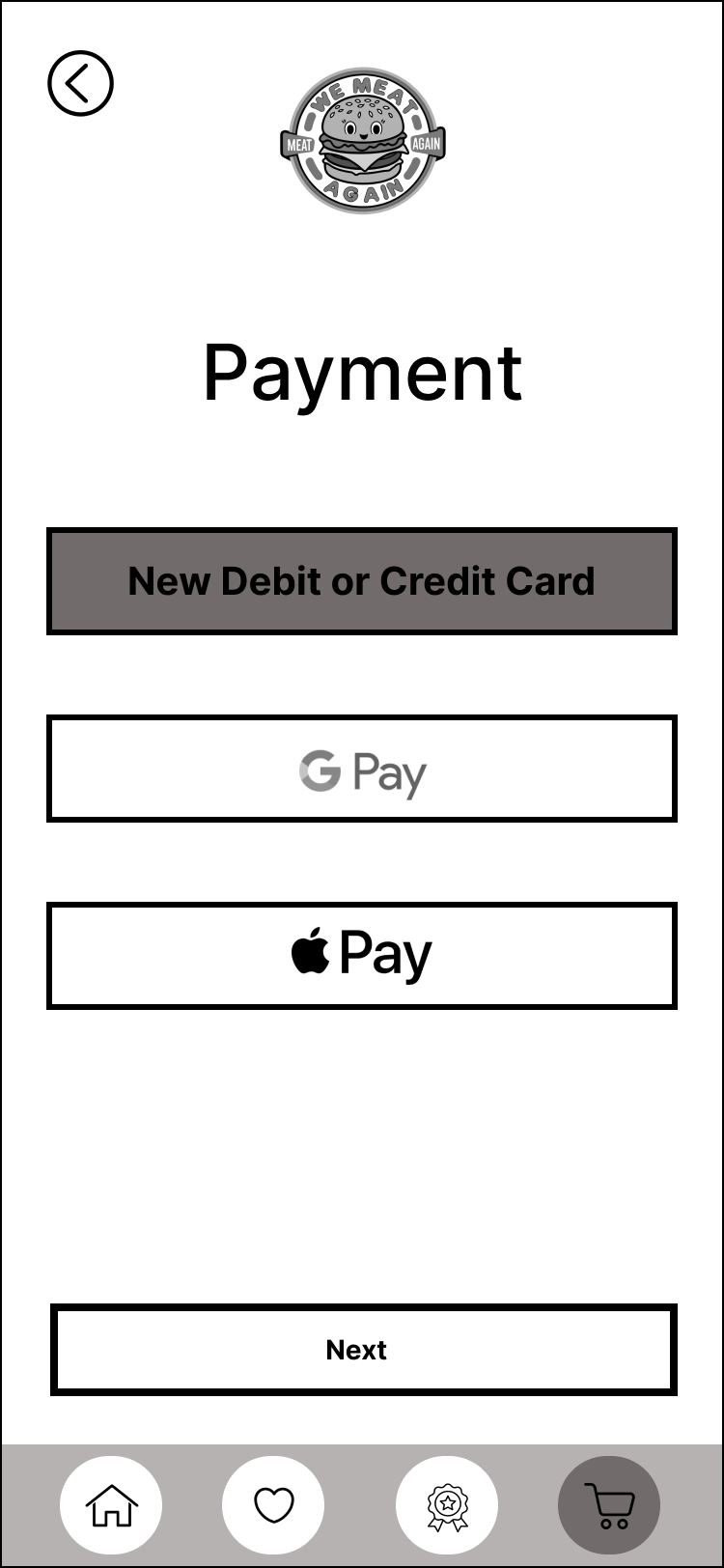


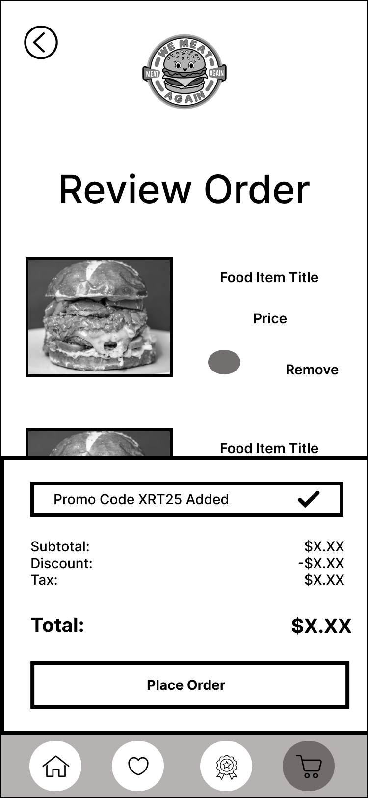
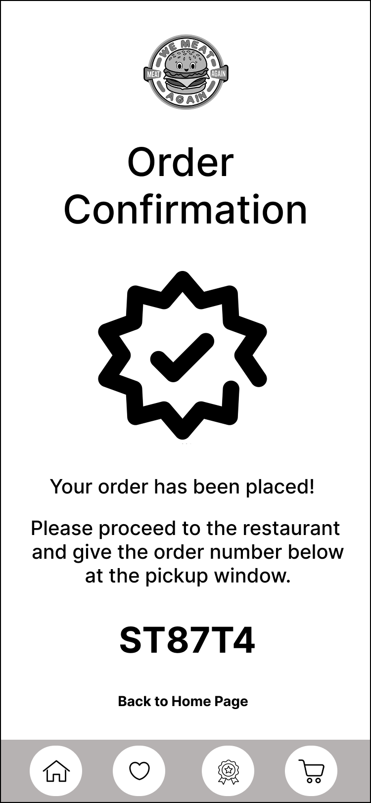
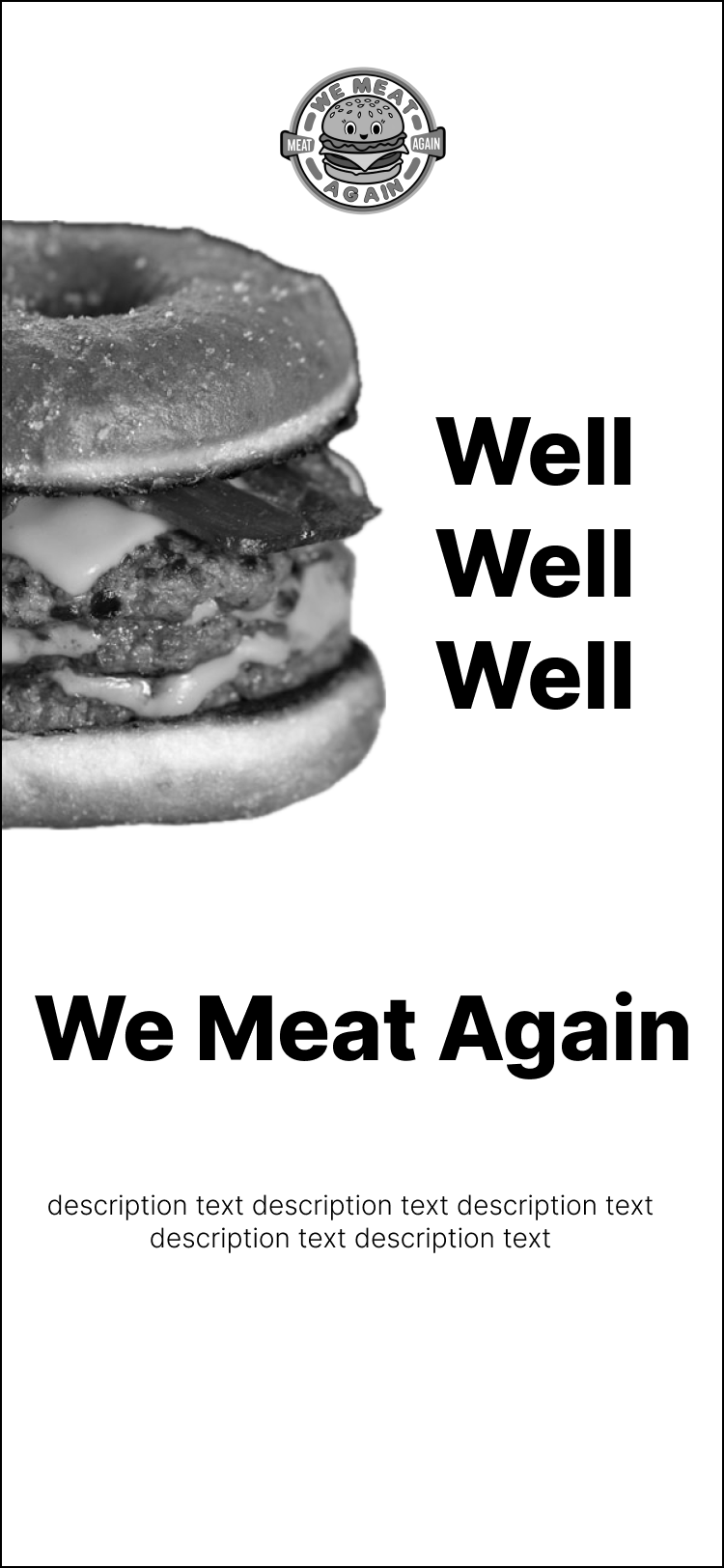
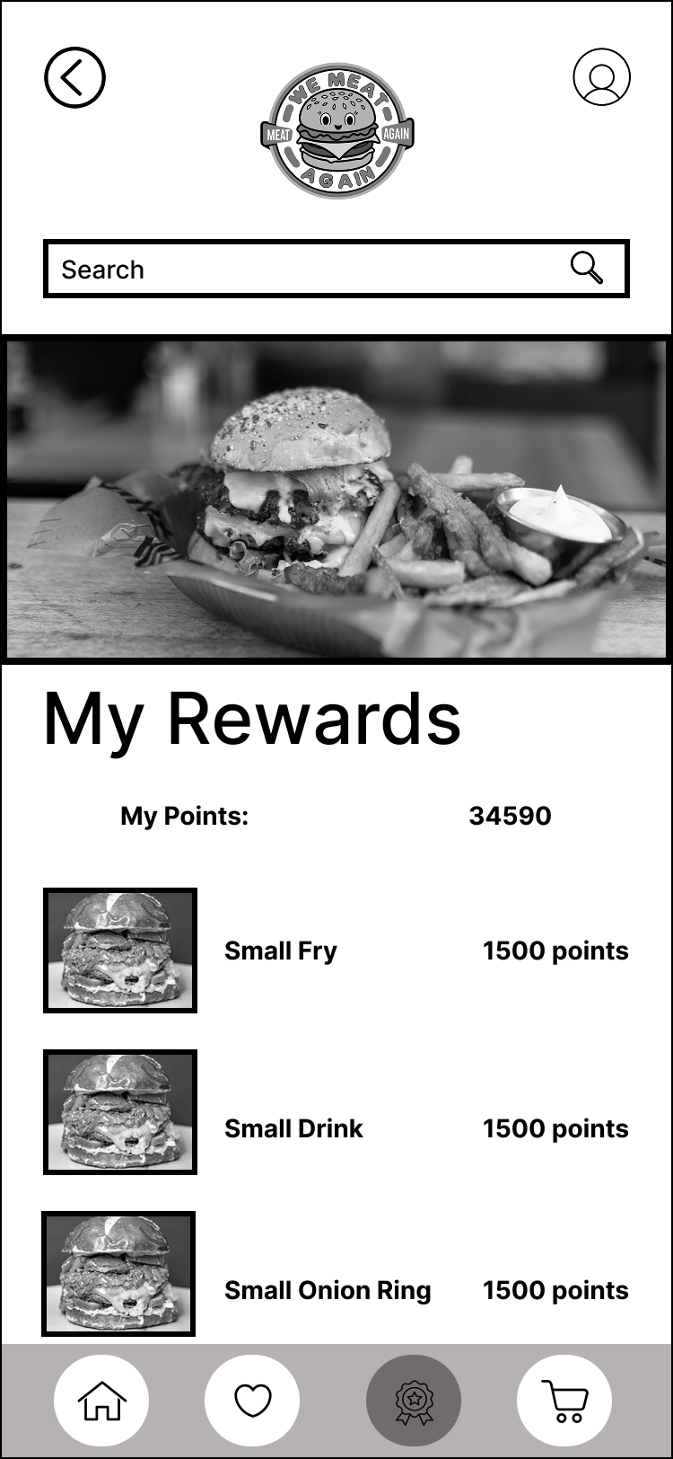
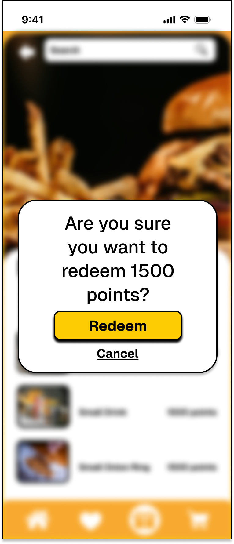
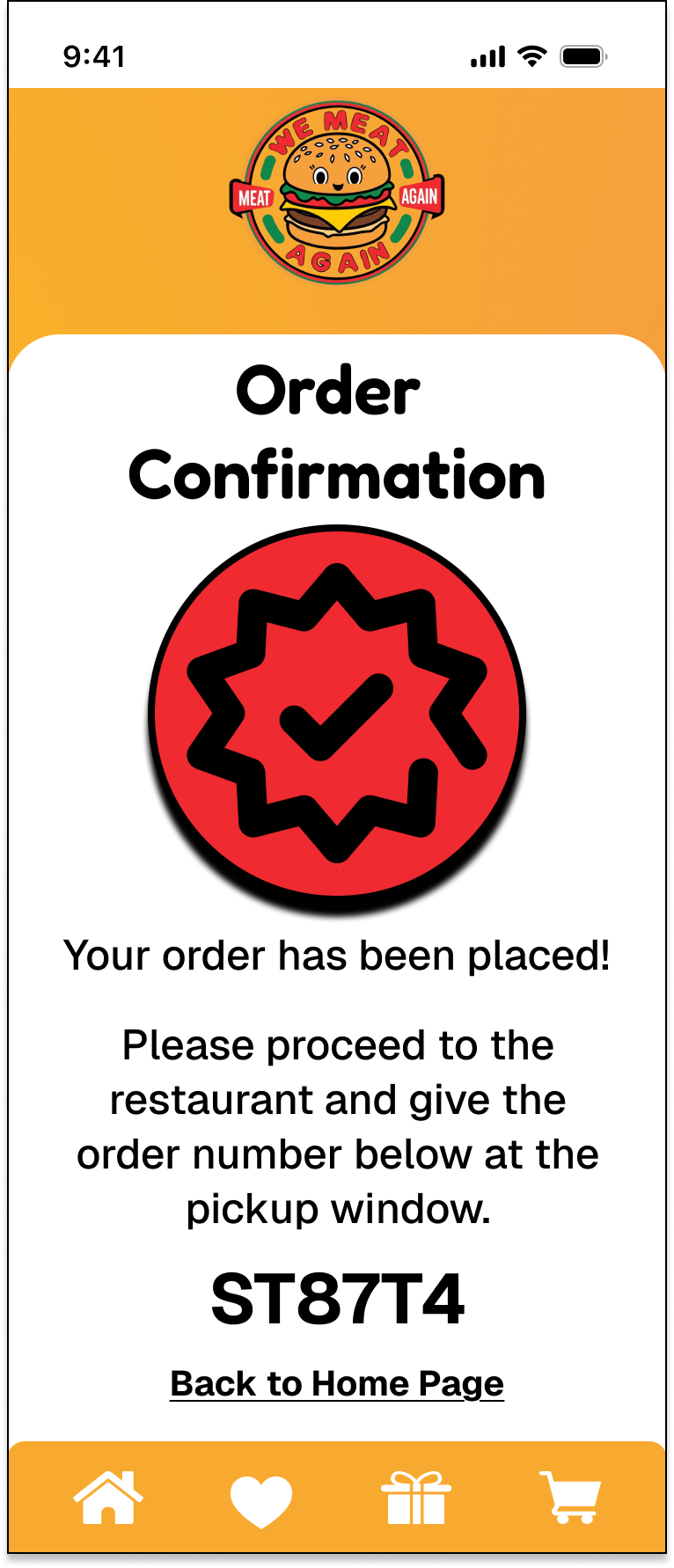
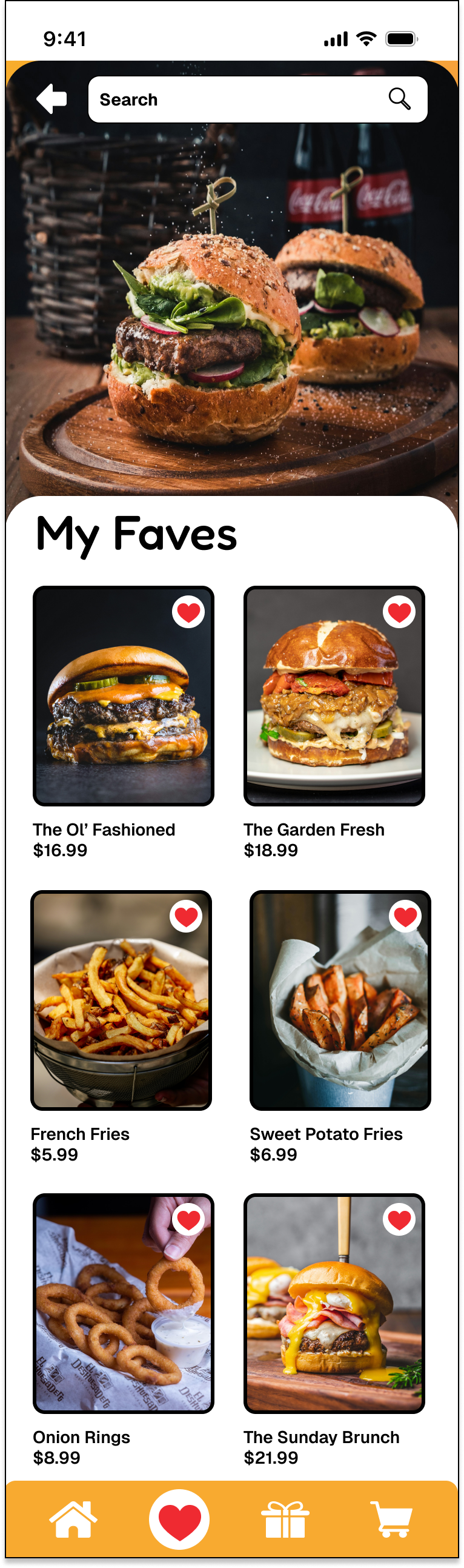
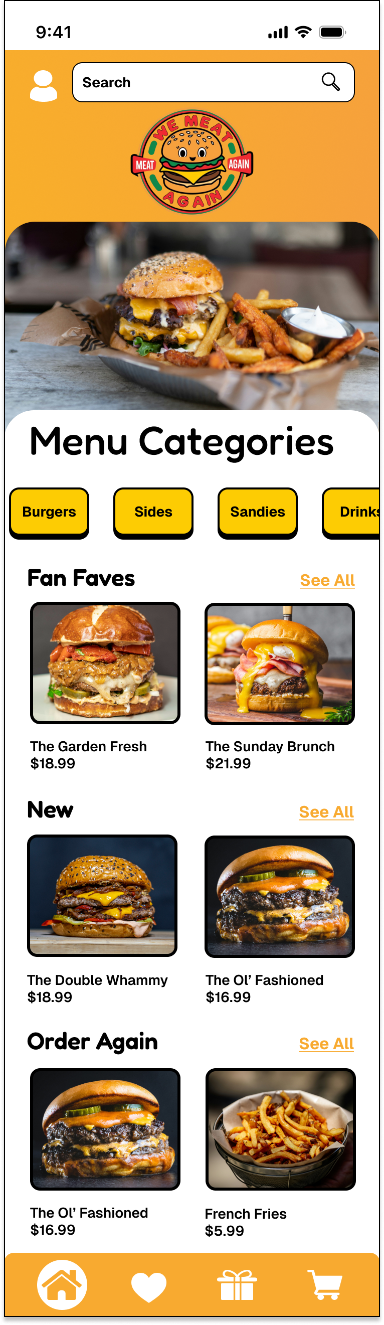
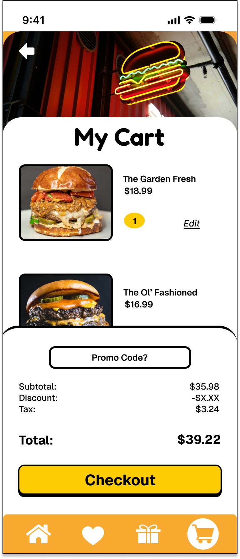
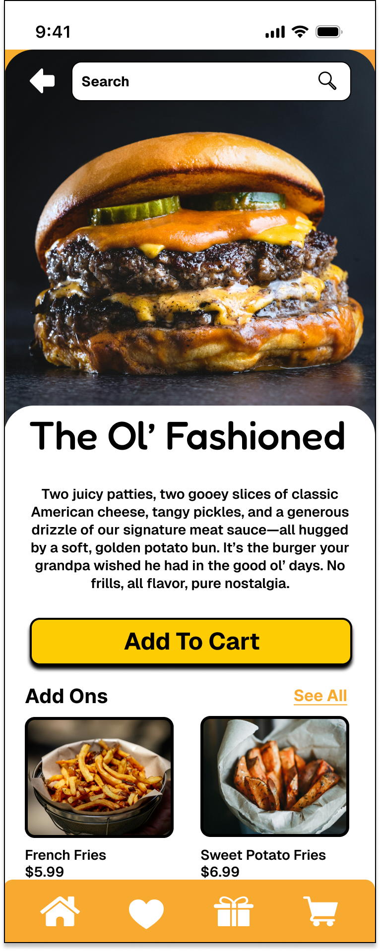
High-fidelity wireframes brought the full We Meat Again brand to life. I applied the color palette, typography, iconography, and imagery to create an immersive, on-brand experience. These polished screens reflected everything from juicy burger photos to playful language and vintage diner cues—ensuring that users felt the vibe from the moment they opened the app. Every visual choice reinforced the brand’s identity while enhancing clarity and engagement.
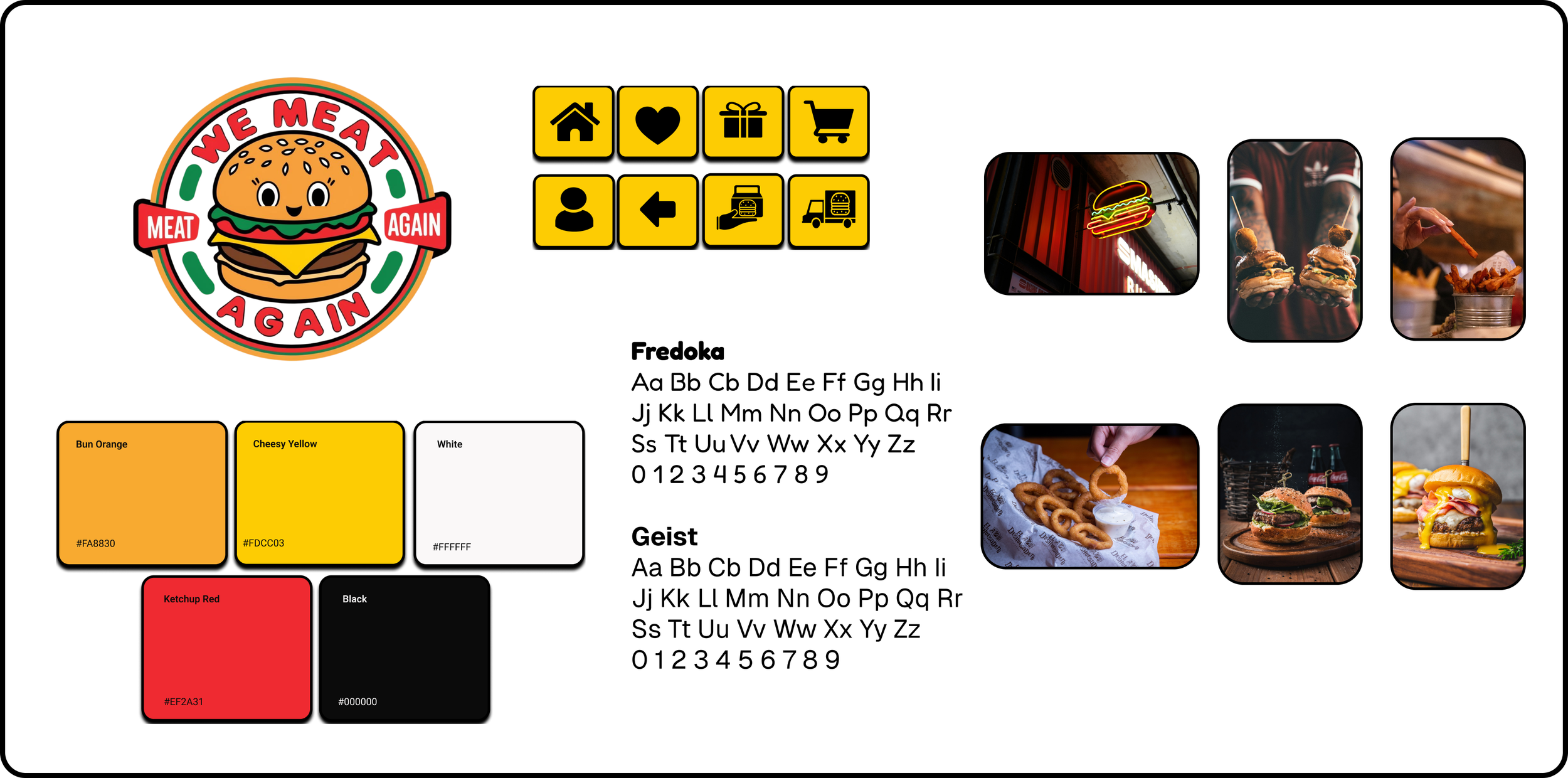
Branding Guide


To ensure consistency across every digital and physical touchpoint, I created a visual branding guide for the We Meat Again app. This included primary and secondary fonts (Fredoka and Geist), a mouth-watering retro-inspired color palette, bold black iconography, and photography guidelines focused on bright, staged food shots. The branding guide helped anchor the entire design system, making sure that everything—from buttons to burger shots—spoke the same visual language.
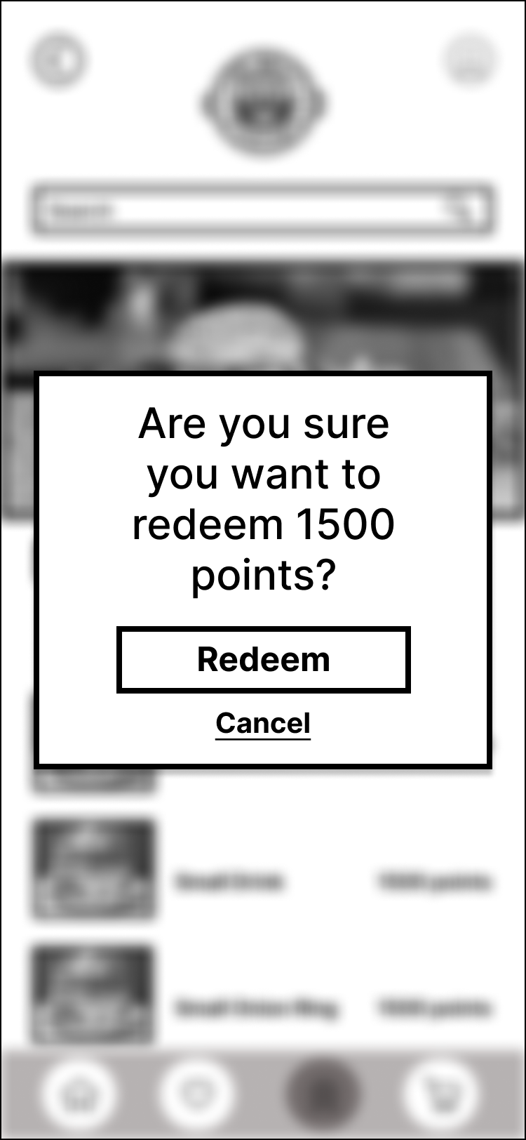
To simulate the full user journey, I built a clickable prototype of the mobile experience. This allowed for usability testing and gave users a clear vision of how the final product would look and function. From tapping into the menu to redeeming rewards points and checking out, the prototype showcased the full ordering flow—complete with animations, interactions, and a little bit of flair. It was the ultimate taste test before final development.
While the current prototype of We Meat Again brings the brand to life in a digital space, there are plenty of exciting next steps on the horizon. If this were moving forward into development, the next phase would include:
Usability Testing: Conducting formal testing sessions with target users to gather feedback on interaction flow, visual clarity, and any points of confusion or friction.
Iterative Design Updates: Refining the interface based on testing insights—especially around customization flow, menu filtering, and reordering ease.
Expanded Features: Exploring additional user-centered features like order tracking, loyalty rewards, social sharing, and accessibility enhancements.
Developer Handoff: Preparing detailed documentation, design specs, and component libraries for a smooth transition into development.
There's also room to explore how the brand could expand beyond the app—into merch, physical packaging, and even branded digital experiences like mini games or meal quizzes. Because when a brand is this fun, it shouldn’t be limited to just one screen.
Designing We Meat Again was more than just creating a burger app—it was about bringing an entire brand experience to life through thoughtful UX and vibrant visual storytelling. One of the biggest wins was seeing how the app successfully balanced personality and practicality. From a bold, retro interface to intuitive flows and craveable imagery, every decision was rooted in real user needs without compromising the brand’s quirky charm.
Reflecting on the process, one of the most valuable takeaways was just how impactful strong research and storytelling can be. Starting with open-ended user interviews and translating those insights into personas, problem statements, and features allowed me to design with clarity and confidence. It also reinforced the importance of designing for real people—not just screens. Whether users were customizing a burger to the last pickle or choosing where to eat based on Instagram-worthiness, their voices were present in every part of the solution.
This project helped me grow not only as a designer, but as a strategist, researcher, and storyteller. It was a reminder that great UX isn’t just about function—it’s about flavor.