

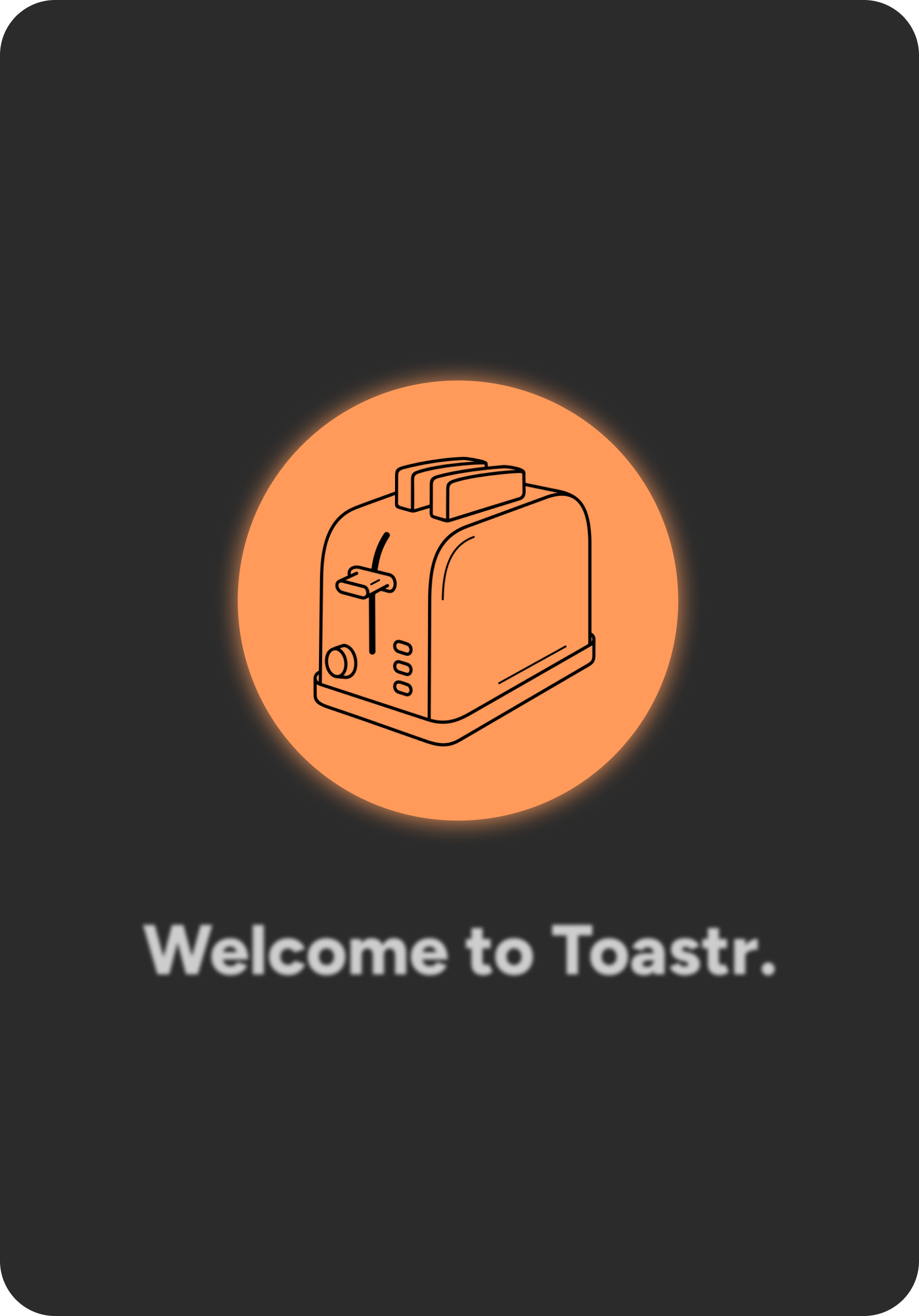
Toastr.
Toastr. is a sleek, touch-screen toaster concept designed to elevate the everyday breakfast ritual through bold branding, minimal dark-mode UI, and smart, intuitive interaction. Take a look at how I brought form, function, and a little fun to the future of toast.
Introduction
Toastr. is a concept project developed in response to a very real design gap: the outdated, underwhelming experience of the modern toaster. Despite being one of the most frequently used kitchen appliances, traditional toasters have failed to keep up with users’ evolving expectations for customization, clarity, and control.
This case study explores how I applied user research, UX strategy, and strong visual design to reimagine the everyday ritual of toasting — creating a sleek, intuitive touch-screen interface for a new smart toaster product. Guided by interviews, behavioral insights, and comparative analysis, I identified key user frustrations with existing models and uncovered meaningful opportunities to improve interaction.
From these insights, ToastR was born: a minimalist dark-mode UI enhanced by bold iconography, glowing orange accent cues, and food-forward visuals that bring both functionality and personality to the table. More than just a toaster upgrade, ToastR represents a shift toward smarter, more considered product design — where every slice, swipe, and glow reflects the user’s taste.
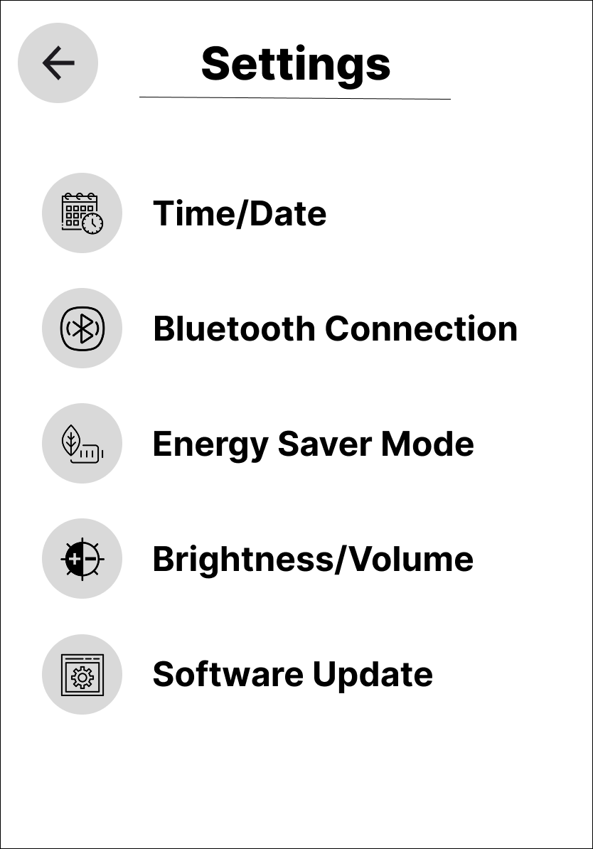
Project Summary:Toastr. is a concept for a smart, touch-screen toaster designed to modernize the breakfast experience through sleek dark-mode UI, bold branding, and intuitive interaction. Guided by user interviews and competitive analysis, this project reimagines the traditional toaster with a streamlined interface, craveable food visuals, and a clever brand personality — turning a daily habit into a design-forward moment of delight.
Role:
UX/UI Designer, User Researcher, Visual Designer
Tools Used:
Figma & Canva
Let’s Talk Toast
Toasters have remained largely unchanged for decades, offering limited control, minimal feedback, and dated interfaces that no longer match the expectations of today’s tech-savvy users. Current models lack personalization, visual clarity, and the kind of intelligent design we’ve come to expect from modern kitchen appliances.
Users are frustrated by vague settings (e.g., numbers with no clear outcome), inconsistent results, and a lack of feedback during use. As smart homes and connected devices become more prevalent, the toaster feels increasingly out of sync — a static product in a dynamic environment. There’s an opportunity to reimagine the toaster experience through a user-centered, touch-screen interface that blends intuitive usability with a modern, personality-driven brand.
Goals & Objectives
Create a dark-mode interface that is modern, bold, and minimal
Design a visual system that feels smart and playful, not cold
Simplify food selection and toast settings through intuitive UI
Incorporate brand personality into every touchpoint
Deliver a cohesive product experience, from logo to iconography to interaction
Defining the Problem
Methodologies Used:
Primary Data Collection: 1:1 User Interviews
Secondary Data Collection: SWOT Analyses
Data Synthesis:
Affinity Mapping
Problem Statements
User Personas
User Flows
User Interviews
To better understand the needs, habits, and frustrations of toaster users, I conducted remote interviews with a diverse group of participants. These conversations were guided by a full set of exploratory questions, ultimately focused on uncovering what influences user satisfaction, what features are missing from existing models, and how users make decisions around toast settings — from bread types to doneness levels.
The interviews were centered around three key questions:
What does and does not influence satisfaction in existing models of this product?
What improvements are users looking for within the new version of this product?
What choices are users more likely/less likely to choose while using this product? Ie. types of bread, levels of toasted for the bread to be, temperatures the toaster can be set to, cook times, ect.
These interviews helped surface key behavioral insights and emotional touchpoints, revealing not just what users want, but why they want it. The findings laid the foundation for problem statements, feature prioritization, and the overall user experience strategy behind Toastr.
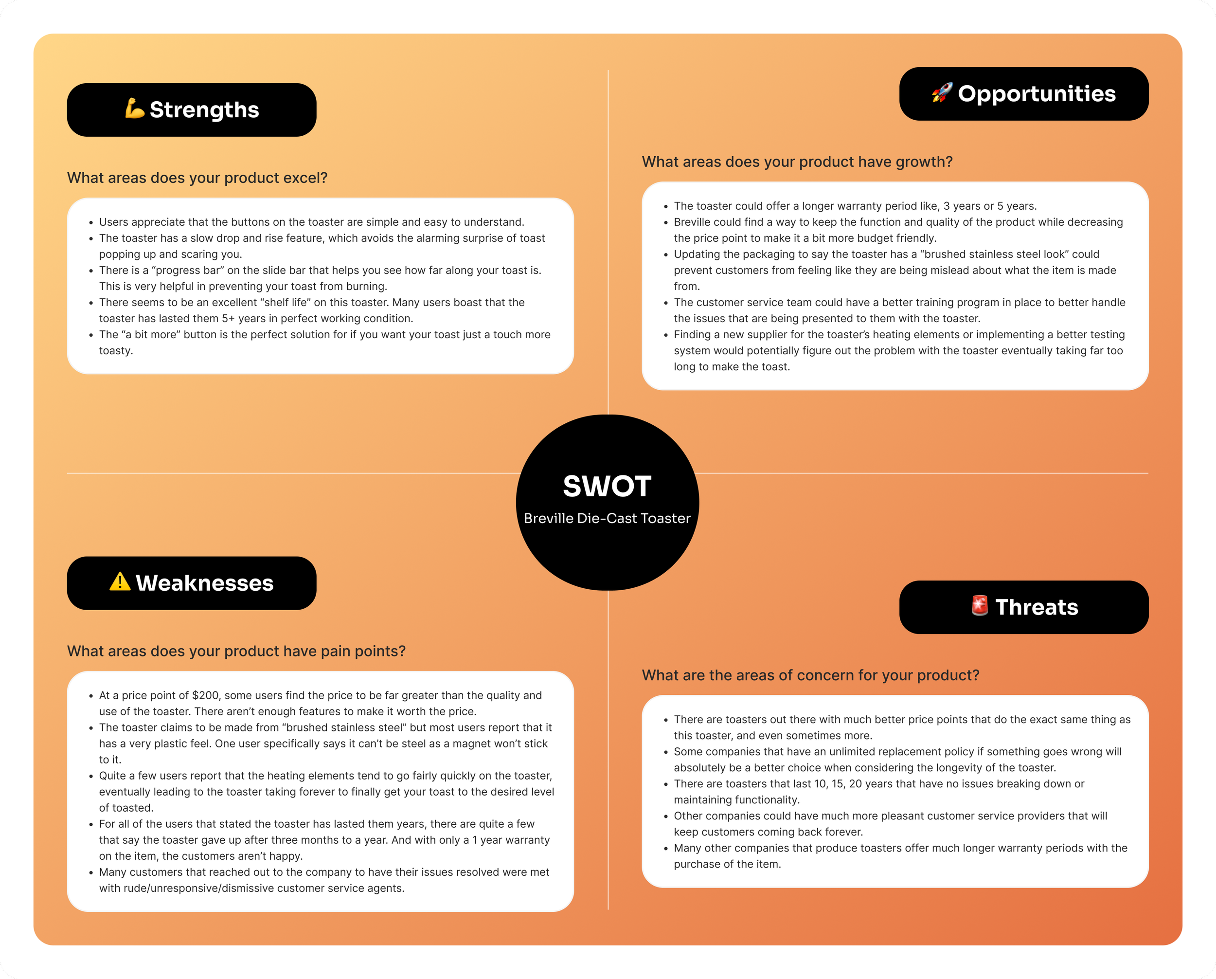
SWOT Analyses
To better understand the competitive landscape and uncover opportunities for innovation, I conducted SWOT analyses of existing toasters and smart kitchen products. This process helped identify the strengths and weaknesses of current models, as well as external opportunities and threats that could influence product direction.
By comparing traditional and smart appliances, I was able to pinpoint key gaps in usability, customization, and visual feedback — all of which informed the strategic direction of ToastR. These insights supported feature decisions, brand positioning, and helped shape a product that stands out in both form and function.

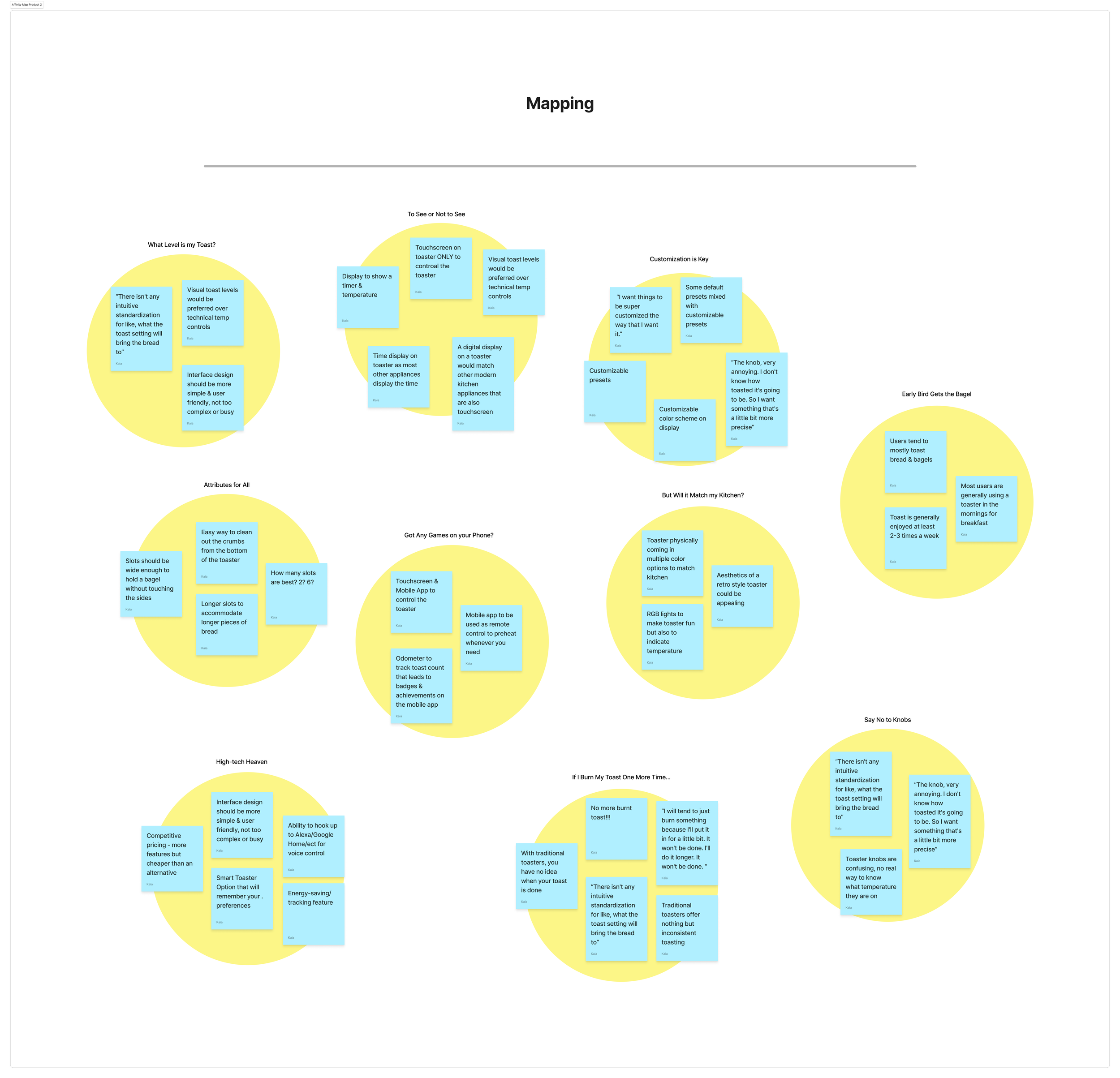
Affinity Mapping
Designing the Solution
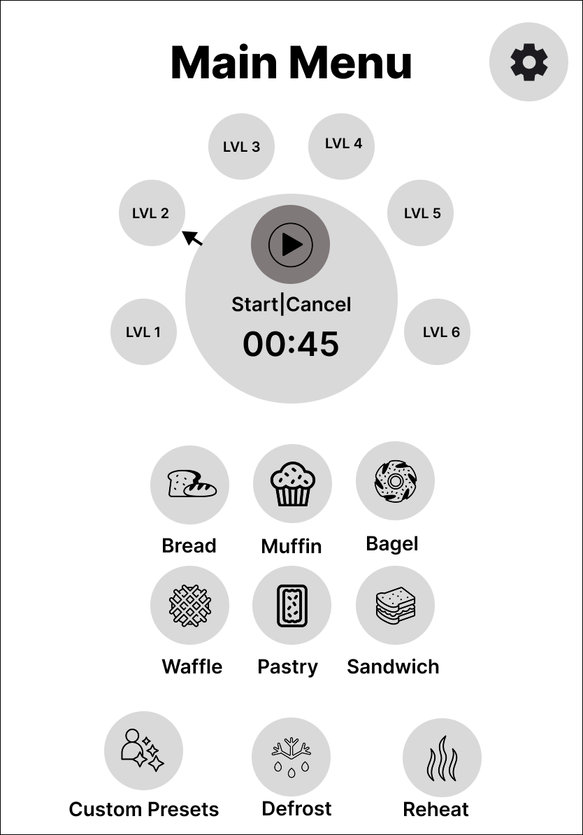
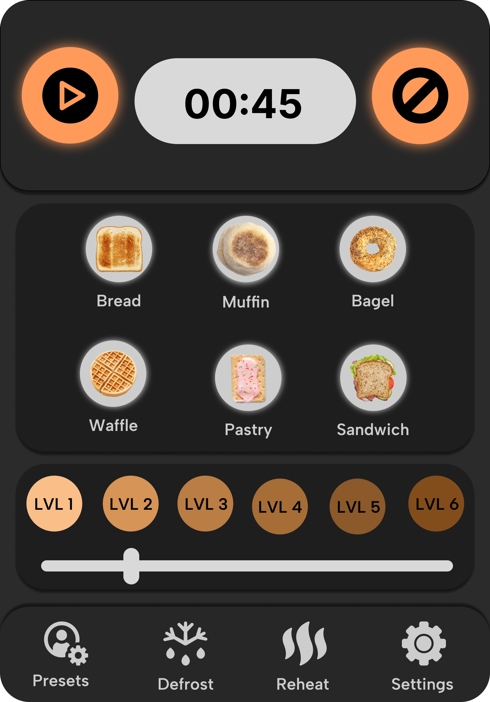
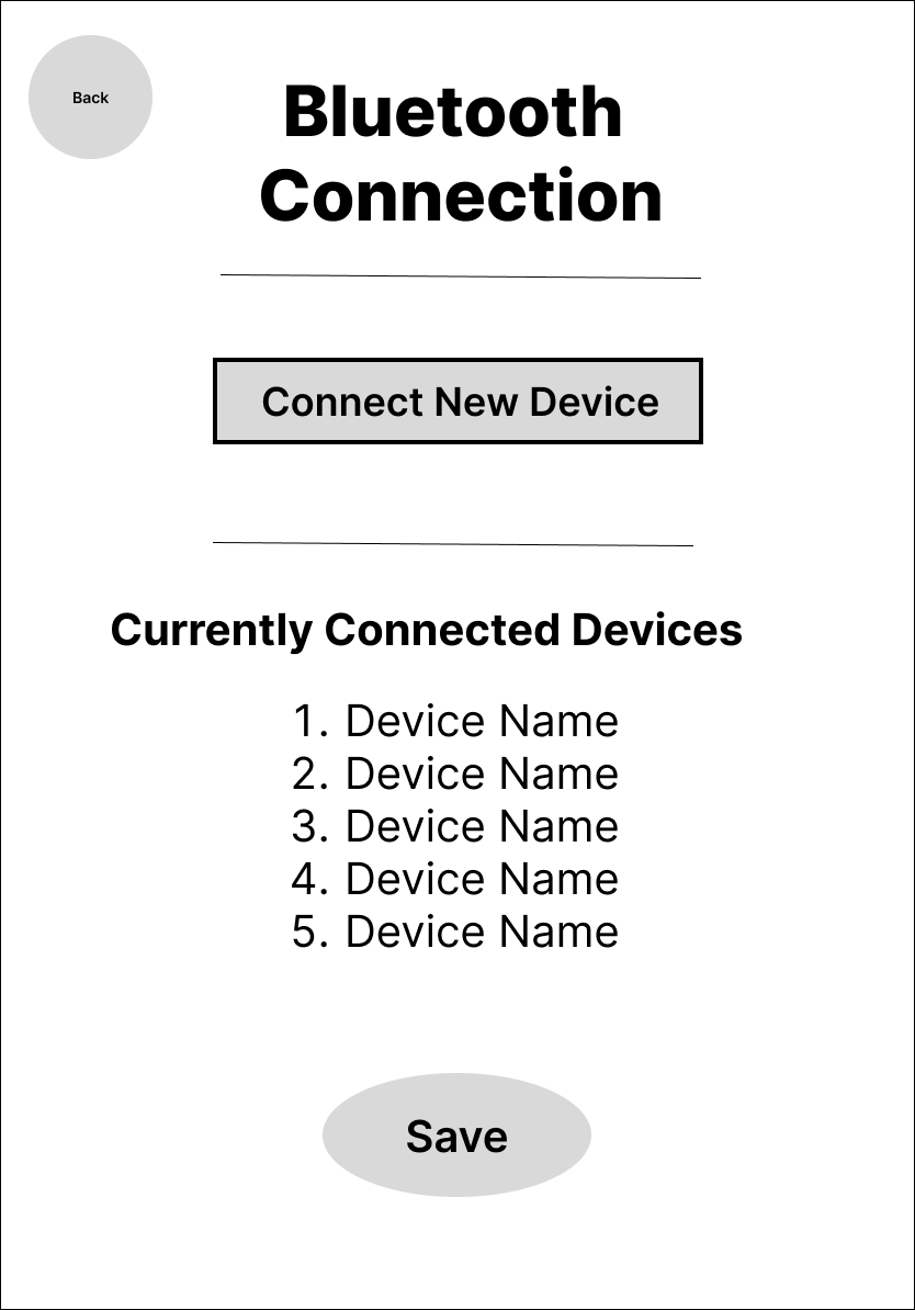
Toastr.’s visual design balances function with flair — sleek dark-mode surfaces meet glowing orange accents, creating a UI that feels both intelligent and inviting. From bold iconography to craveable food imagery, every element was designed to be clean, intuitive, and just a little bit cheeky. The interface doesn’t just guide the user — it expresses the brand.
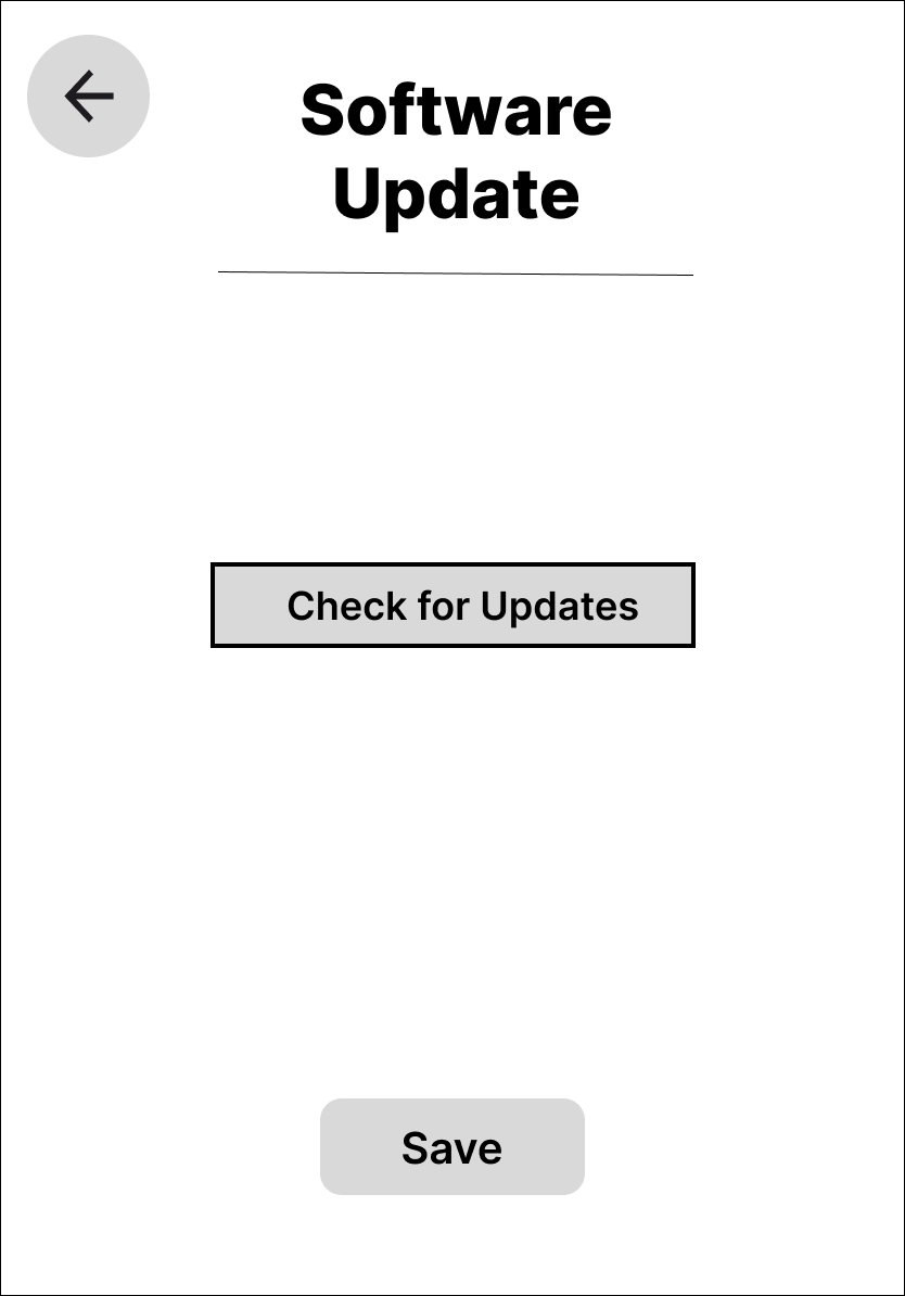
Lo-Fi Wireframes
I began with lo-fi wireframes to establish structure and user flow without getting distracted by visuals. These quick sketches focused on key tasks like selecting food types, adjusting toast settings, and reviewing progress. The goal was to validate layout ideas and screen hierarchy early in the process.
Mid-Fi Wireframes
Hi-Fi Wireframes
After conducting user interviews, I synthesized key quotes, behaviors, and pain points into an affinity map to identify patterns and shared themes. Grouping these insights allowed me to make sense of user needs at a higher level, uncovering common frustrations with traditional toasters and highlighting expectations for smarter, more intuitive experiences.
This method helped translate raw research into actionable problem statements and feature priorities — laying the foundation for user personas, core interface decisions, and the overall Toastr. experience.
Problem Statements
Through user interviews and affinity mapping, I identified two distinct user groups with specific frustrations and unmet needs around existing toasters. These problem statements highlight not just functional pain points, but also the emotional weight behind daily use — from time pressure to the desire for seamless smart home integration.
Each statement helped ground the design process in real-life context, guiding decisions around core features, interaction flows, and brand tone. These users weren’t just looking for toast — they were looking for trust in their appliances.
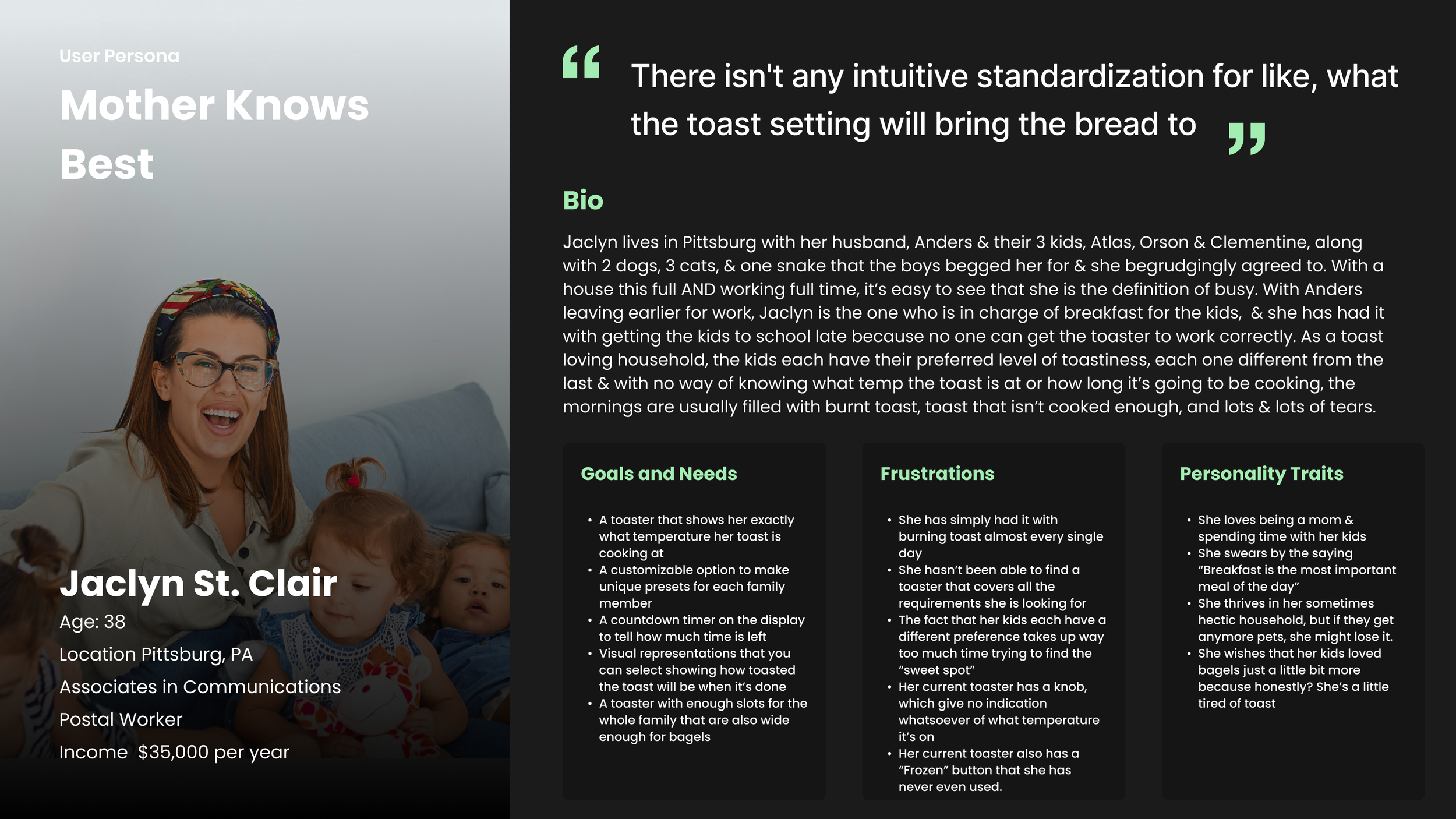
User Problem #1: The Busy Parent
“As a busy mom of 3, whose mornings are already hectic enough, I need a toaster with multiple slots that shows me the exact level of doneness I can expect before I even put the toast in — and that delivers accurate results. With our current toaster, it’s a guessing game, and if I leave it in for 2 seconds too long, it’s burnt. I’m super frustrated because I don’t have time to wait around for toast while also making sure my kids get to school on time.”
Key Needs Identified:
Predictability & precision in browning
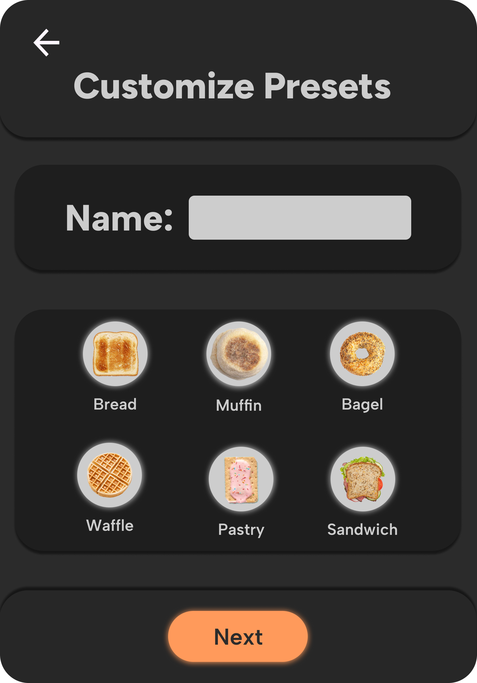
Clear visual feedback before toasting
Multi-slice functionality
Speed and efficiency
User Problem #2: The Tech-Savvy Home Designers
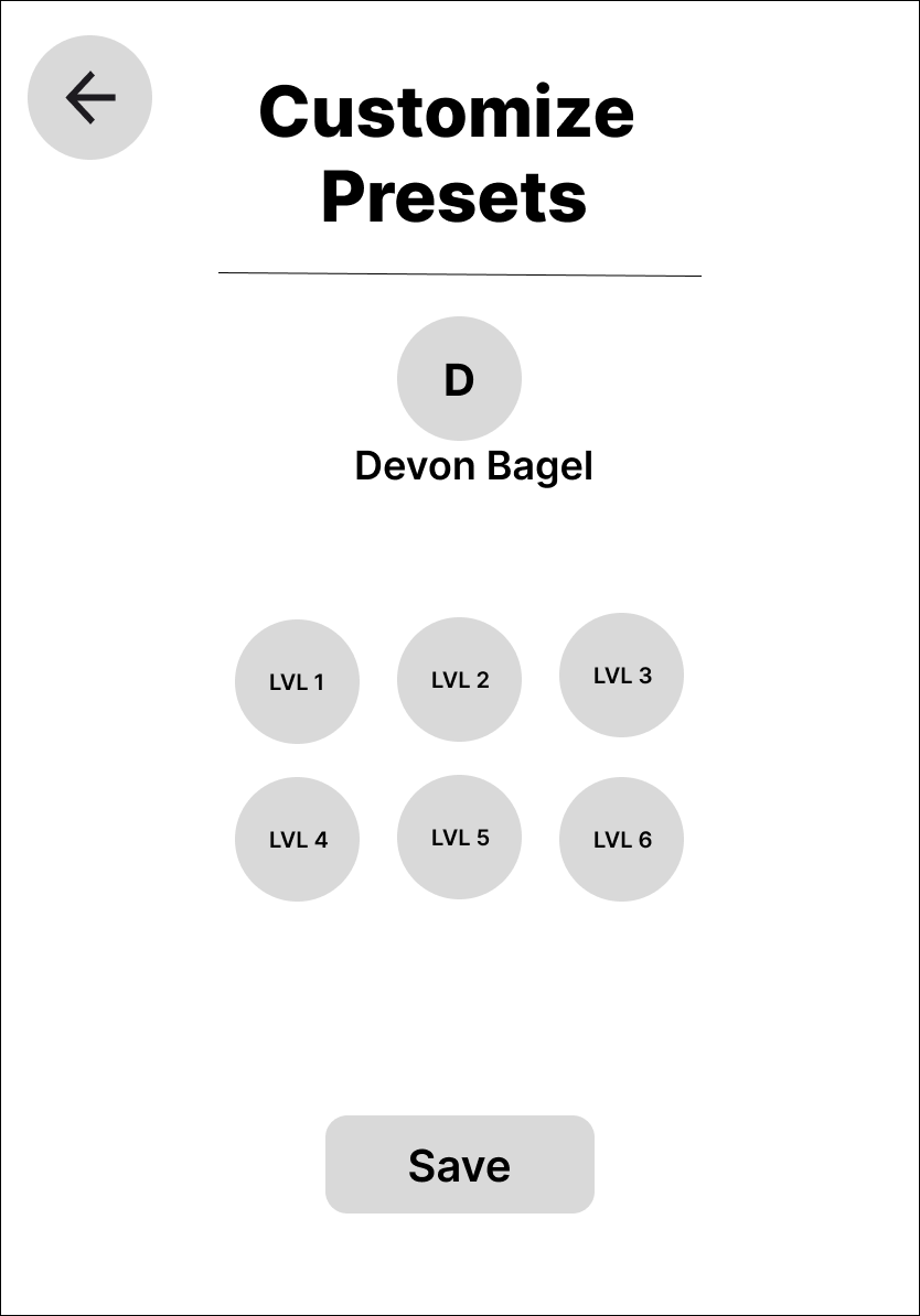
“As a busy pair of house flippers, my husband and I are looking for a high-tech toaster with a touch screen, customizable capabilities, a mobile app, and energy tracking so it matches the rest of the smart appliances in our latest flip. None of the toasters on the market offer all the features we want, and it’s super discouraging that our dream toaster might not exist.”
Key Needs Identified:
Integration with smart home systems
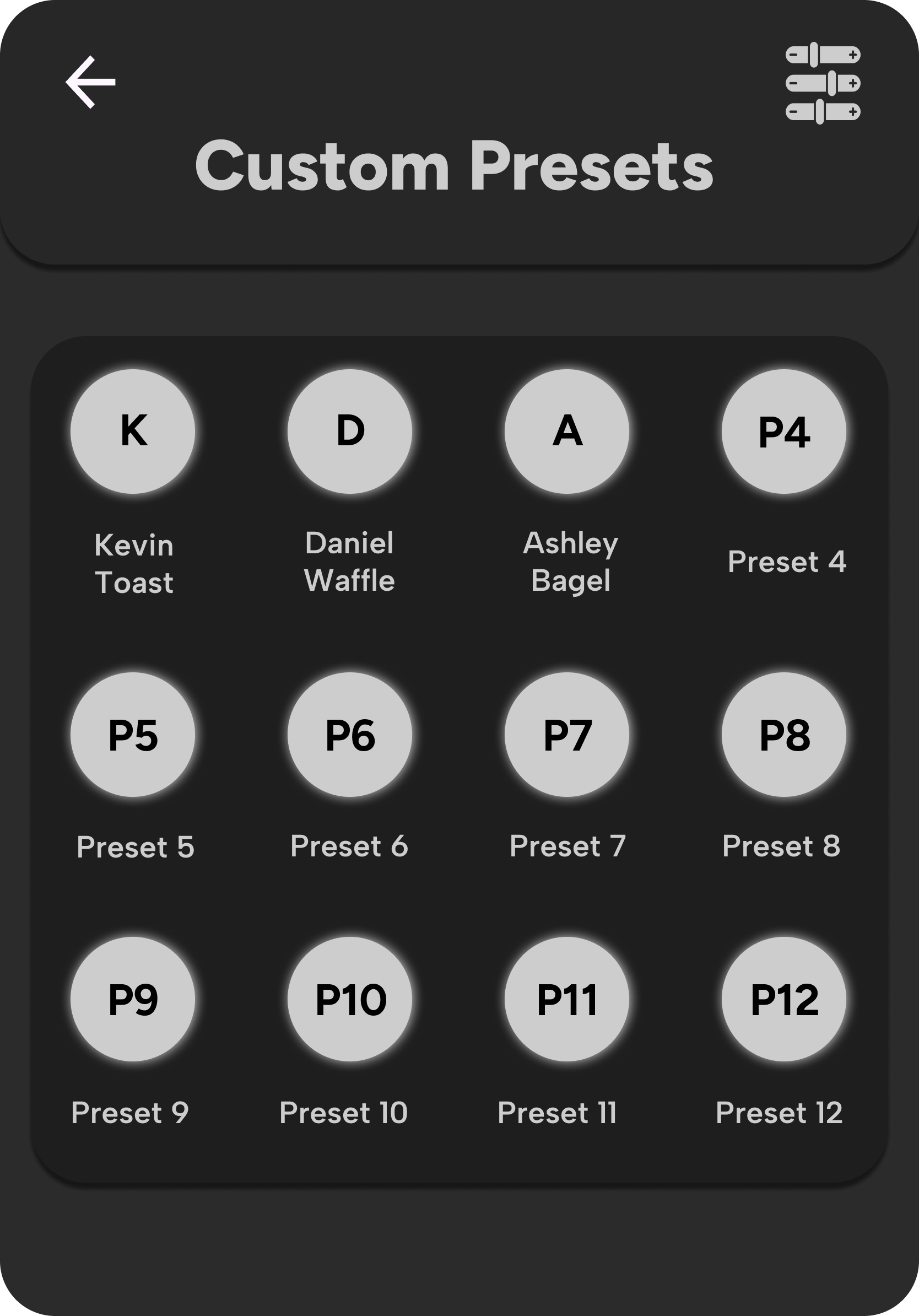
Customization (user presets, tech-forward features)
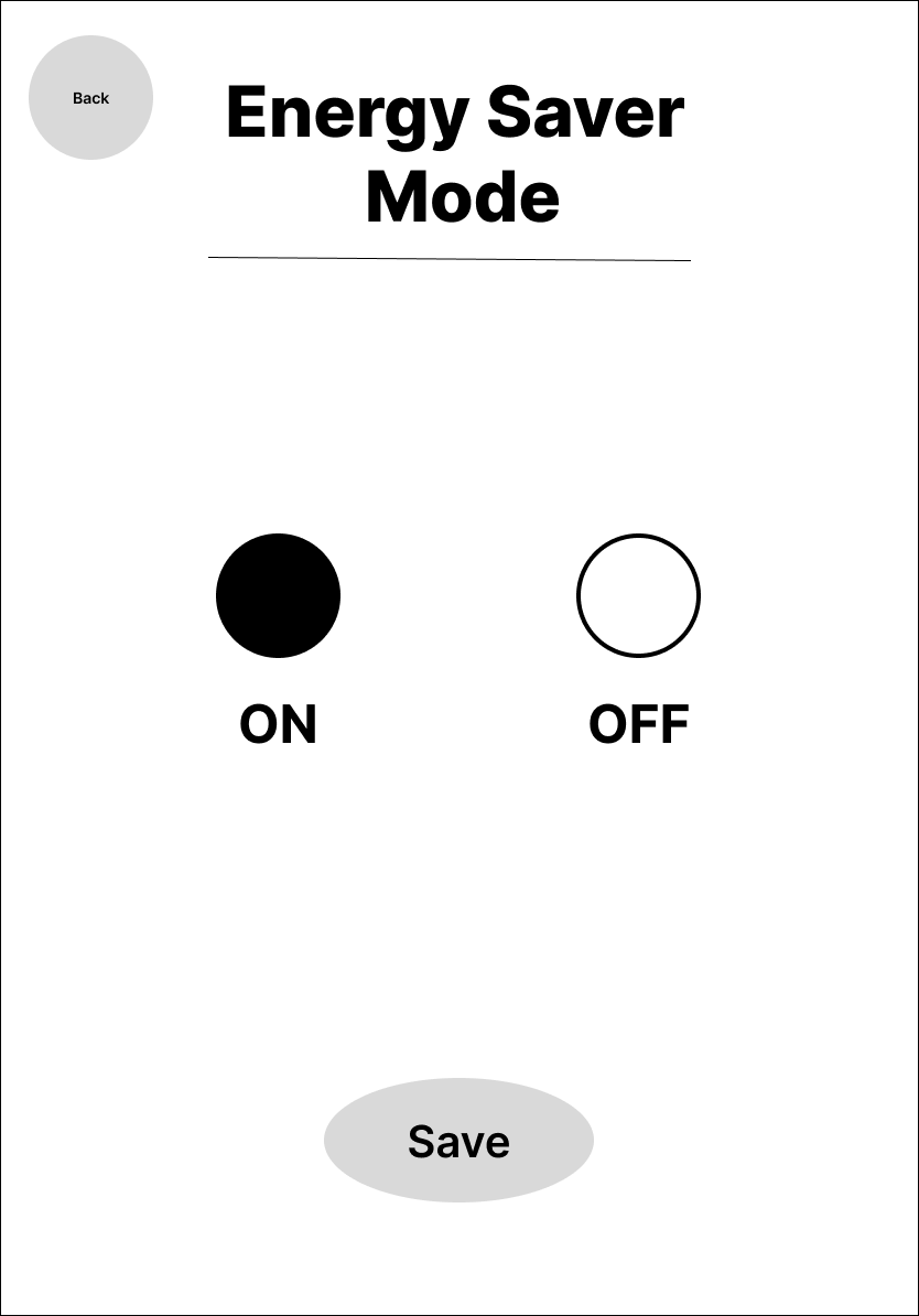
Aesthetic alignment with other modern appliances
App connectivity and energy awareness
These problem statements helped anchor the product direction for Toastr., ensuring the final interface didn’t just look good — it meaningfully solved real problems with clarity, confidence, and personality.
User Personas
To guide design decisions and ensure user-centered functionality, I developed two primary personas based directly on interview insights and problem statements. These personas helped keep the experience grounded in real-world needs, frustrations, and lifestyle contexts — serving as reference points throughout the design of ToastR’s interface and feature set.
How These Personas Informed Design:
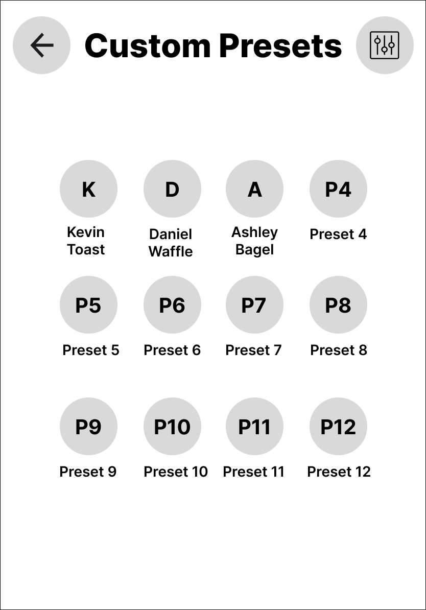
Jaclyn’s needs directly informed the inclusion of toast previews, multi-slot functionality, and customizable “doneness” profiles for multiple users.
Delta & Asher inspired the sleek, dark-mode UI, smart features, energy-conscious design cues, and the creation of a confident, tech-savvy brand voice.
These personas reminded me that good design isn’t just about screens — it’s about solving real problems for real people, in ways that feel intuitive, delightful, and smart.
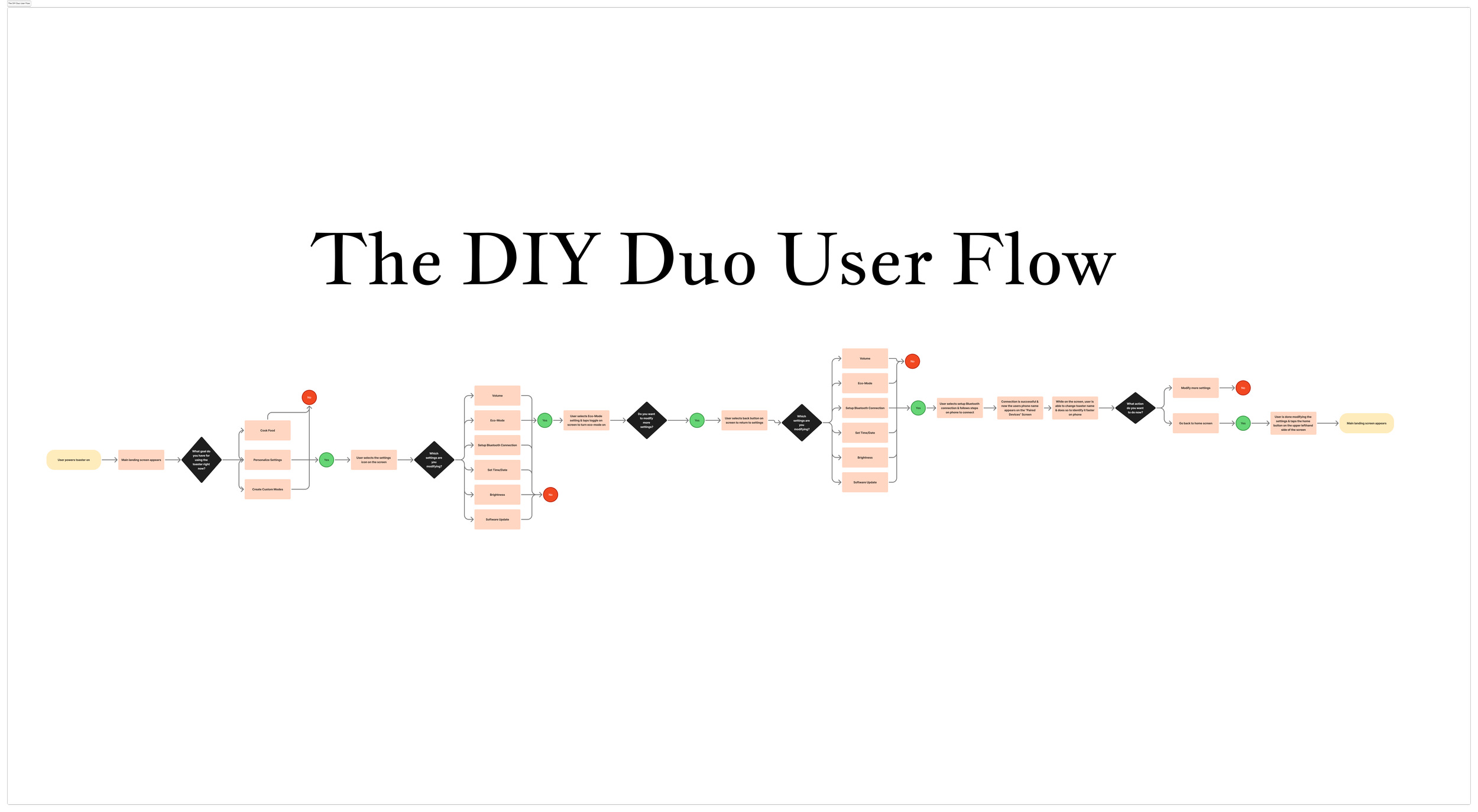
User Flows
To ensure the interface was intuitive and tailored to real-world usage, I created two primary user flows — each based on a key persona and their specific needs. These flows helped visualize the steps users would take to accomplish their goals, identify decision points, and shape the structure of the interface around real behaviors.
By designing around these distinct journeys, I was able to prioritize clarity, reduce cognitive load, and bake in functionality that feels natural, not forced.


Branding Guide
Prototype
Next Steps
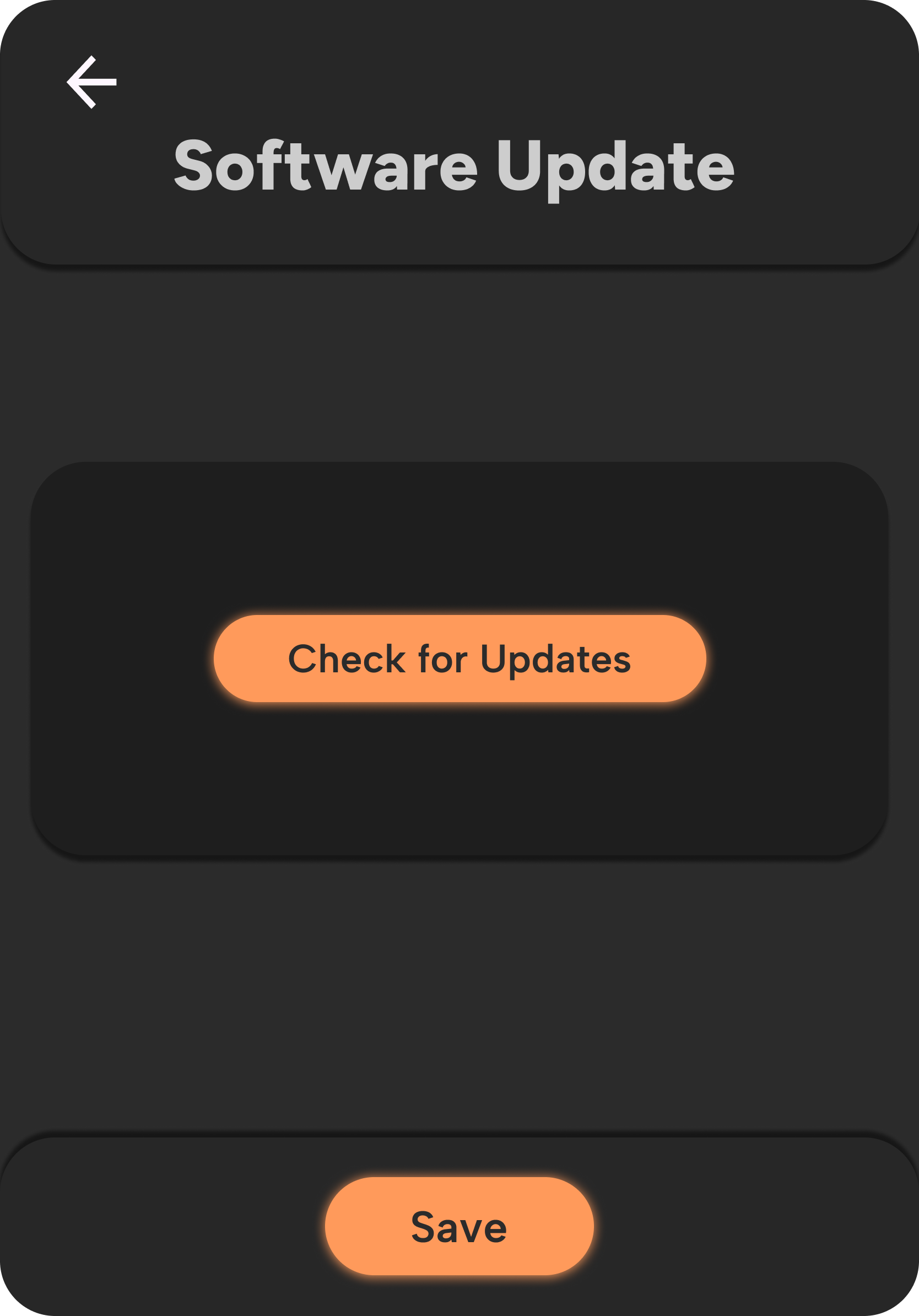


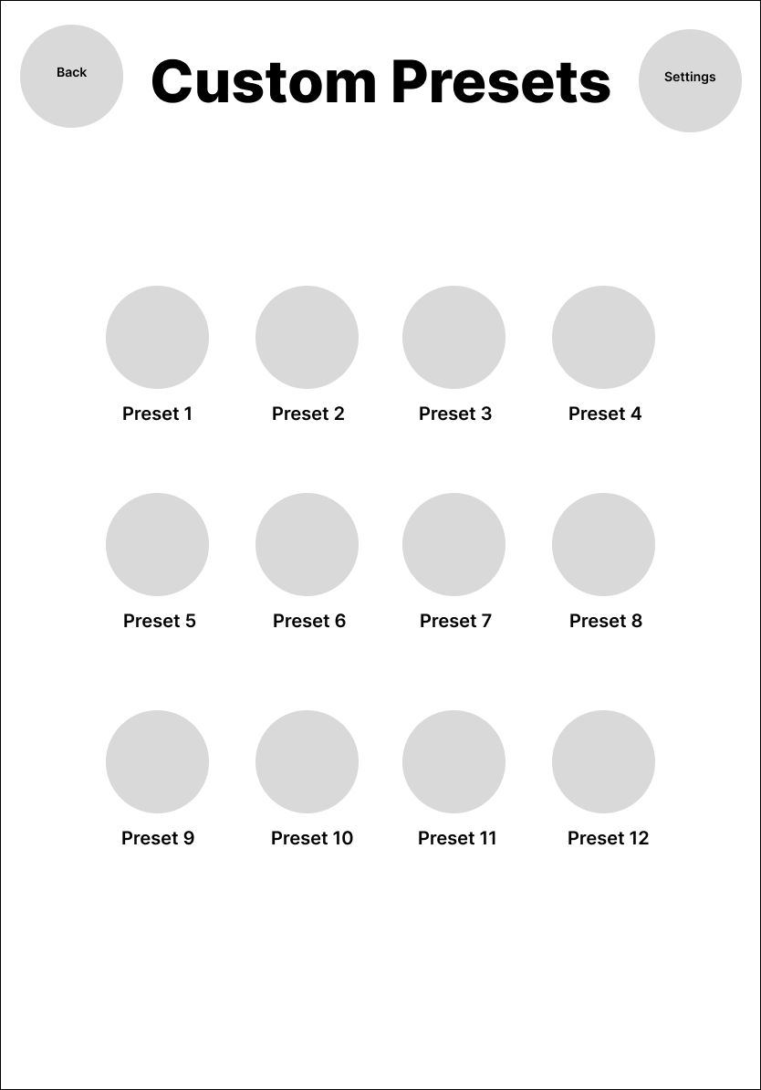
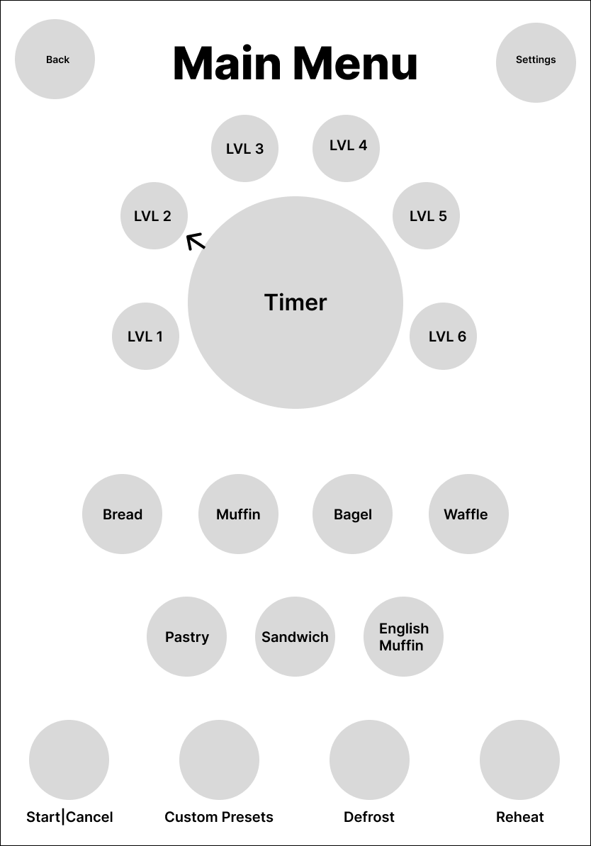
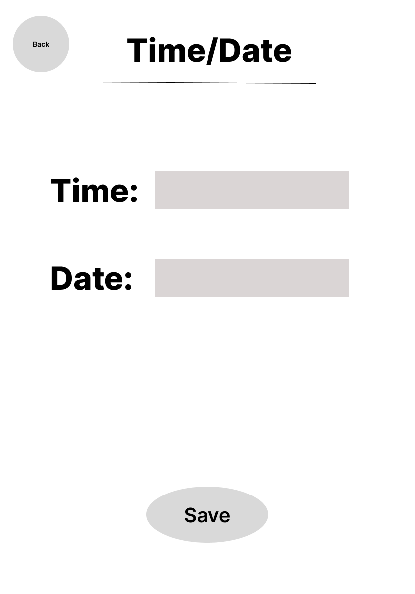
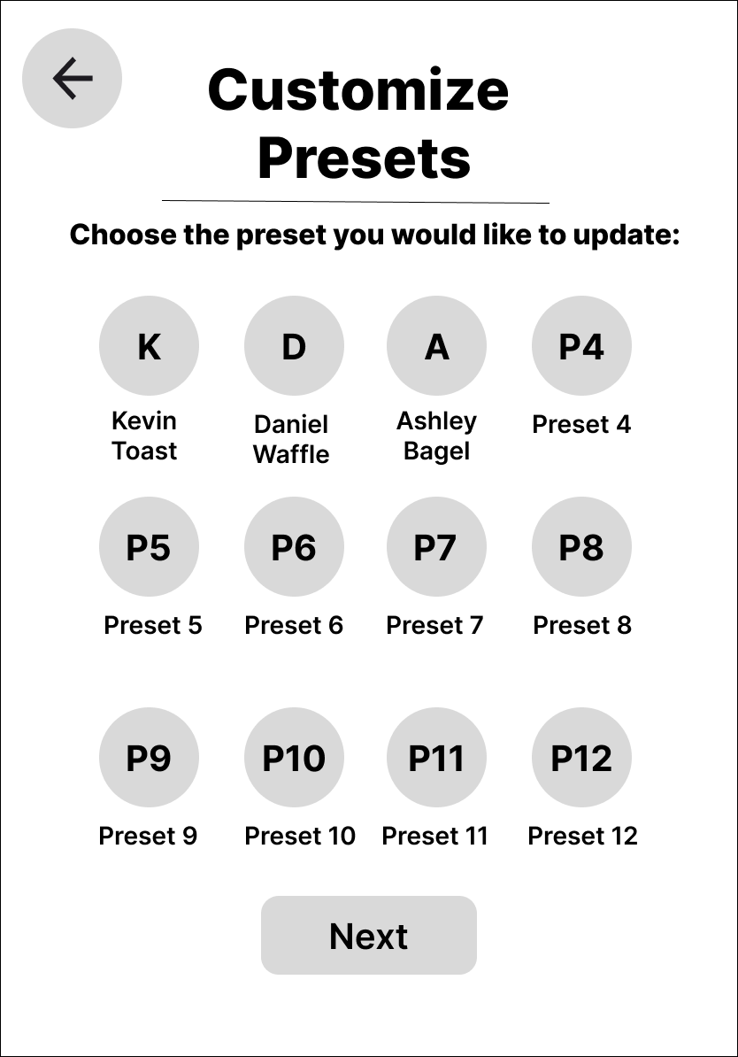
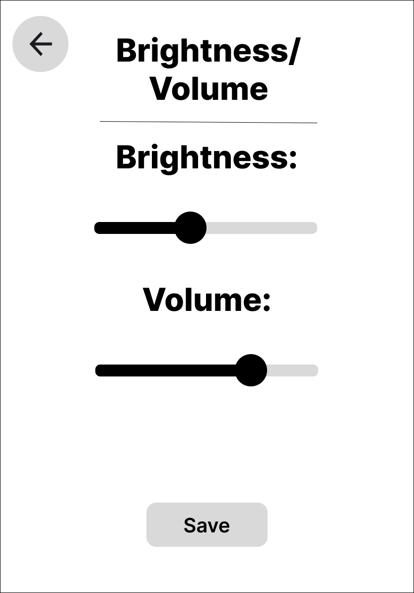
With the structure locked in, I moved into high-fidelity design, incorporating the full ToastR brand system — including typography, iconography, and the dark-mode color palette. The interface came to life with glowing orange accents, food visuals, and clean touch targets. These hi-fi screens were built for usability and personality.

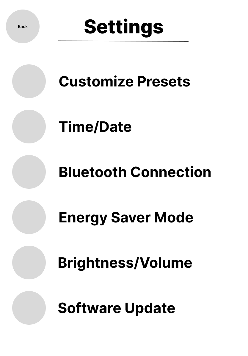
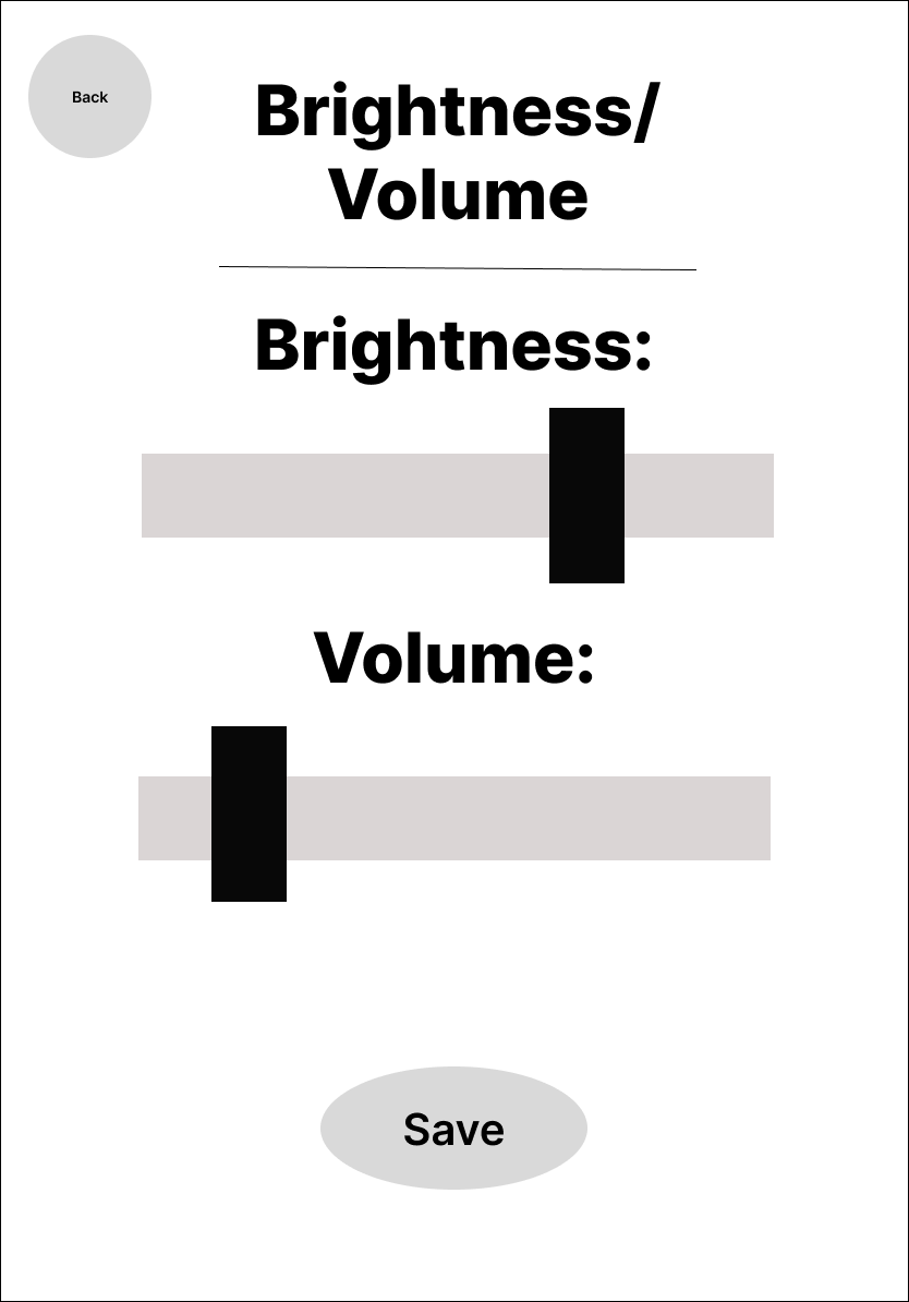
In the mid-fi stage, I refined layout decisions, added system feedback elements (like software updates and confirmation screens), and explored interaction patterns such as slider controls and toast previews. This step helped ensure the interface was logically organized and user-friendly before applying branding and polish.

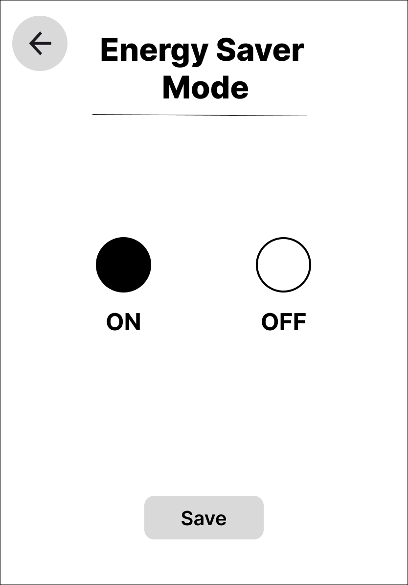
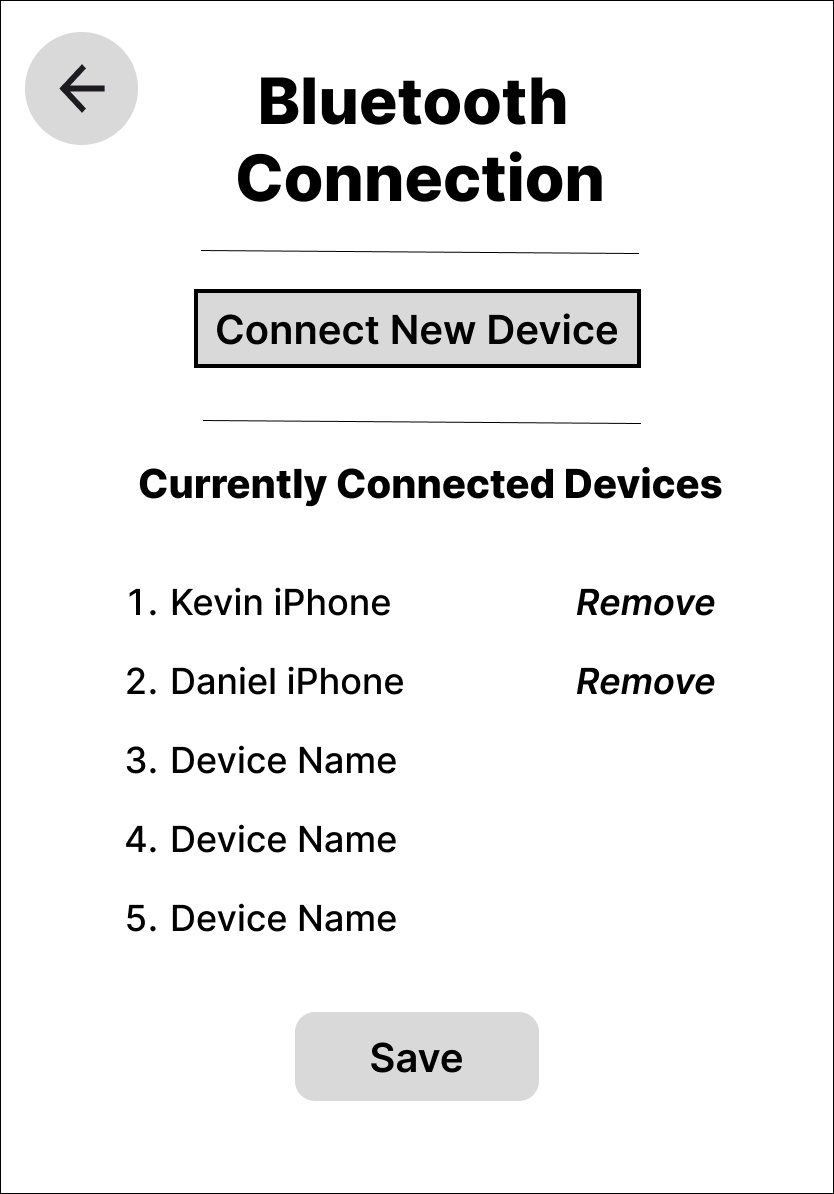


ToastR’s branding was designed to be bold, clean, and clever — reflecting both its smart-tech positioning and its playful personality. The brand guide outlines all visual and verbal components: logo usage, glowing orange color palette, confident dark-mode type system (Figtree and Albert Sans), iconography rules, and food-forward imagery. Together, these elements create a cohesive system that’s not just modern — it’s memorable.

To simulate the user experience and test interaction flow, I created an interactive prototype using Figma. This clickable mockup allows users to navigate through key paths — from selecting a food item to confirming toast settings — and experience the interface as it would function in real life.
If brought into a real-world product cycle, the next phase of ToastR would focus on testing and iteration. I’d conduct usability testing on the interactive prototype with target users — particularly those with family-focused and smart-home needs — to validate toast selection flows, doneness preview accuracy, and overall intuitiveness.
From a technical perspective, further collaboration with engineers and hardware designers would be essential to ensure the interface translates smoothly to an embedded system or appliance-grade touchscreen. I’d also explore app integration, voice controls (e.g., “make my usual toast”), and accessibility enhancements like haptic feedback or adjustable text sizes.
Lastly, I’d love to expand the brand experience into packaging, onboarding animations, and a playful physical UI sound system. Because with Toastr., we’re not just building a toaster — we’re building a smarter, more satisfying morning ritual.
Outcomes & Reflections
Designing ToastR challenged me to think beyond surface-level aesthetics and reimagine a daily interaction that most users take for granted. Through user interviews, research synthesis, and iterative wireframing, I created an experience that solves real frustrations while feeling elevated, fun, and distinctly modern.
One of the most rewarding outcomes of this project was translating emotionally driven feedback — like stress over hectic mornings or the disappointment in underwhelming “smart” appliances — into tangible design solutions. Whether it was Jaclyn needing faster, more reliable toast for three picky kids, or Delta and Asher looking for an appliance worthy of their high-tech kitchen, each persona directly shaped the design decisions that led to ToastR’s core features.
This project reminded me how even the most ordinary products can benefit from thoughtful UX. With the right balance of clarity, charm, and innovation, even something as simple as making toast can become a more personal, efficient, and delightful experience.